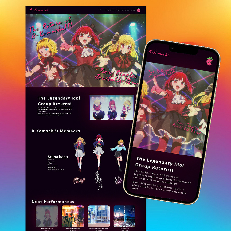
B-Komachi Webpage Design
A large project and a small vacation in the middle has meant I haven't had time to keep up with my weekly UX/UI Design challenge. So enjoy this work I did a couple months ago when I was starting out. It's a simple design but I still enjoy the work I put into it
With this project I was mostly going off of inspiration I had gotten at the time from the Anime Series Oshi-no-Ko, which features the fictional Idol group B-Komachi. Using that inspiration I designed a what if? For the group's webpage, using still images from the anime and a few other anime images taken from other shows for the "Performances" section. Not an overall technical design, I made sure to have a basic mobile version as well to showcase a little responsive design as well.
One success I had with this design was the animation for the carousel of each of the groups members, I liked that the two other members were blurred in the background when not selected
One disappointment for me is the background or rather the simplistic nature of the webpage aside from the main elements. If I were to revisit this I would utilize more graphic designs in the visual style of the page
Thank you for taking the time to look at my design! I am hoping to get back to doing these weekly challenges soon so I can give myself more opportunities to continue to grow as a designer. To keep learning new skills, and to continue to enhance the designs I create!

