Interactive Fitness Dashboard (by following UX Principles)
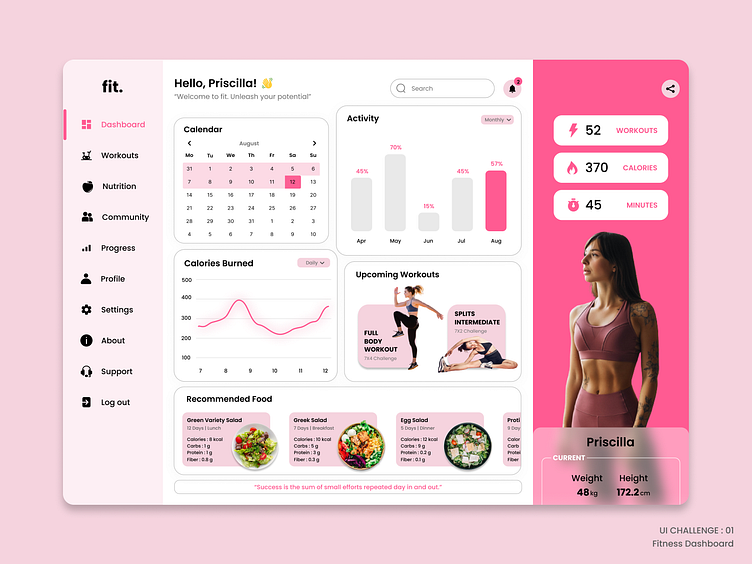
I created a dashboard that help users track their fitness journey, access workout plans, and engage with a supportive community. Mainly I designed this by following some UX Principles. Here are they,
Law of Simplicity: I kept the dashboard clean and uncluttered. I used a minimalist color scheme and prioritized essential information such as progress, upcoming workouts, and notifications.
Fitts's Law: I ensured there was ample spacing between interactive elements to prevent accidental taps.
Law of Proximity: I grouped related elements together.
Law of Similarity: I used consistent visual elements for related content. For example, I employed the same icon style and color scheme throughout the dashboard.
Gestalt Principles: I leveraged the principle of Continuity to guide the user's eye through a timeline of their fitness journey.
Law of Simplicity: I prioritized essential information on the dashboard, such as the user's daily workout, next meal and a short Motivational quote. I kept the design minimal to avoid overwhelming the user.
Miller's Law: I presented workout data and statistics in digestible chunks.
Jakob's Law: I designed the layout in a way that's familiar to users of fitness apps, making it easy for them to find what they need without a steep learning curve.
Social Proof: I incorporated social features that allow users to share their achievements and progress with the community.
