UI Component - Toggle Switch | Uzence
🔀 Embrace the Power of Toggle Switches! 🔀
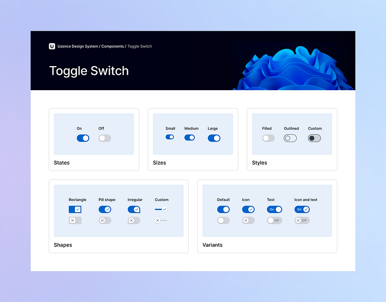
Step into the world of toggle switches, where user control meets sleek design. 🚀 Here's a sneak peek into their dynamic features:
✨ States: Empower your users! Switch between the On and Off states to offer clear and instant feedback.
📏 Sizes: Tailored fit! Choose from small, medium, or large sizes, aligning perfectly with your design canvas.
🎨 Styles: Crafted aesthetics! Opt for filled, outlined, or even custom styles to match your design language.
🔲 Shapes: Define your visual language! From classic rectangles to pill shapes, or even venture into unique irregular and custom forms.
🌟 Variants: Personalize the experience! Explore default toggles for straightforward interactions, enhance with icons, amplify with text, or combine both icons and text for a comprehensive user journey.
Navigate the world of toggle switches and discover their potential for seamless user interactions. Stay tuned for more design insights as we journey through the realm of UI elements. 🎵✨
💖 If you're loving this exploration, hit that 'Like' button and share your thoughts. Happy designing! 🎨✍️
Got a project? Let's talk.
Ready to create unforgettable experiences together? Schedule a call with us for exciting projects and collaborations! Let's shape the future of design, one masterpiece at a time. 🎨🌟
To learn more about us, visit our website at uzence.com
Don't miss out on the creative inspiration and updates! Follow us on LinkedIn Instagram and Facebook 🌈🌌
