Comm Connect Sign Up/Login
Comm connect is a community service applications that is targeting people who wish to volunteer for making a difference in the community. The challenge was to design a short, simple, user-friendly and hassle free sign up / login page.
This design is part of the Daily UI challenge. The prompt was changed to a real world problem to get a better experience while carrying out the challenge.
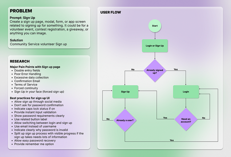
Research
Research plays an important part in UI/UX design as it unfolds user's pain points, struggles and expectations. I thoroughly researched and analyzed the the various pain points of the users while using sign up/ login forms. The most common pain points were then consolidated into the above 7 points.
Next, I also took guidance from experienced UI/UX designers regarding the best practices while designing sign up/login forms. This part played an important role in the entire design process because this clearly stated the user expectations and allowed me to visualize my designs not only as a designer but as a user as well.
User Flow
After the research, it was time to decide the basic user flow that the users will go through to get the task of signing up/logging in accomplished. The main focus of the user flow was to mediate the gap between signing up and logging in. The users should be able to switch from sign up page to login page if already registered and from login page to sign up page if they don't have an account. I added conditional flows on both the pages to facilitate this feature.
Hence the basic user flow is: The user gets the Login or Sign up page (Main page) and gets to decide whether to sign up or login. If they have not signed up yet, the click the sign up button and get the sign up page. In the other case, they would click the login button and get to the login page. On either page there is an option to switch to the other one in case there is a mis-click or some unforeseen situation that requires the user to go to the other page.
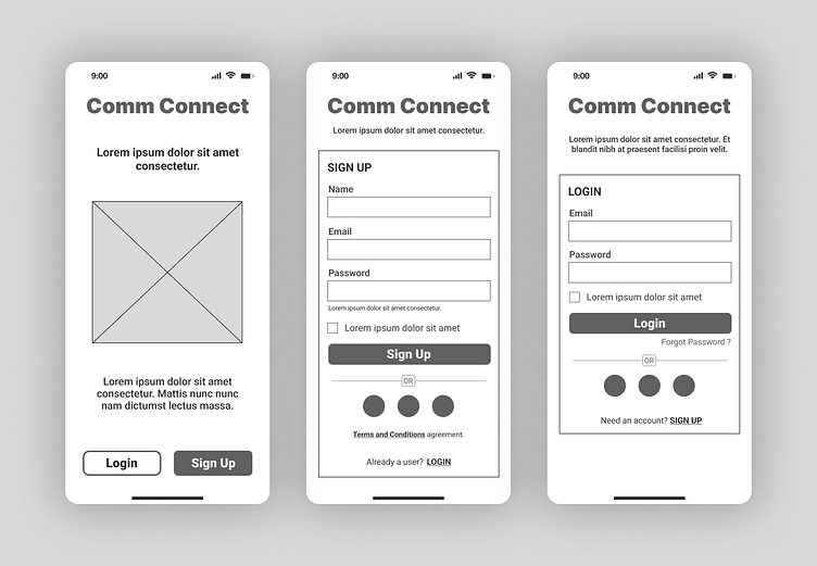
Wireframes
I created the above wireframes in accordance with the user flow defined earlier. As understandable, there are login and sign up buttons on the main page and also an option to switch between pages on both sign up and login page.
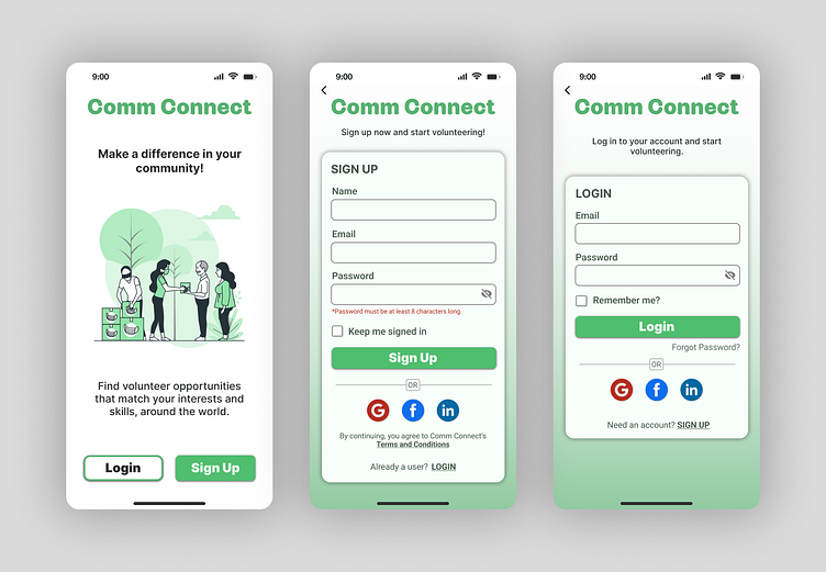
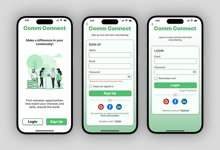
High Fidelity Prototype
Later, I translated the wireframes into high fidelity prototypes with appropriate color palette, typography, components, buttons, and copy. I also realized that there was a need to go back to the main page in some cases and so I added a button for accomplishing this feature.
The buttons were connected to the appropriated pages and transitions were applied to make the interface and motion between the screens effortless, seamless and intuitive.
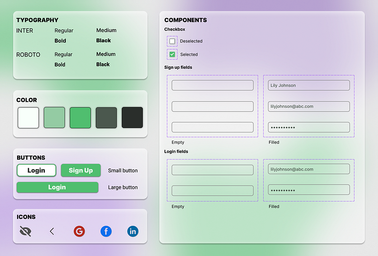
Style guide
This is the style guide that I utilized while creating this project. I tried to use a minimum amount of colors, clear typography, intuitive and familiar buttons and icons, along with necessary components to make the high-fidelity prototype.
You can check the prototype of the above user flow here.
