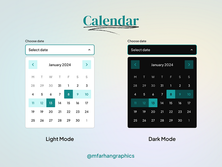
Calendar Card in Light Mode and Dark Mode
This calendar card has a clean, modern interface with an emphasis on scannability and usability.
Key elements include:
Month and Year title prominently displayed at top with large font
Bold subheadings for selected date to allow quick scanning
Minimal, unobtrusive styling - focus is on content
Iconography where appropriate to enhance meaning
Thoughtful use of color to draw attention to key details
Responsively designed for optimal viewing on all devices
The goal is to balance aesthetics and functionality to create an intuitive calendar card that makes it easy for users to quickly grasp the key details and take action. The interface will follow principles of clarity, visual hierarchy, and universal usability.
Thanks for checking it out!
Interested in working with me?
Say hello at mfarhangraphics@gmail.com
