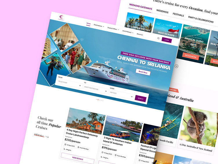
Cordelia Cruise Website Redesign
Cordelia Cruises - an Indian company in cruise travel.
About - With a vision of making cruises sailing affordable luxury, Cordelia Cruises has embarked on making the experience one-of-its-kind for Indian traveler's - among others and emerging as a world-class cruise experience in India.The idea is not to be perceived as the mode of transportation for its passengers but instead to convert them into repetitive traveler's.
Problems with the website's UI
The homepage is cluttered and overwhelming. There is too much information on the page, which makes it difficult for users to find what they are looking for.
There is no Booking Engine for users to search or browse through their required cruises. Users may not even realize that the search bar exists.
The images on the website are not very high quality. They are blurry and pixelated, which makes them look unprofessional.
The overall design of the website is outdated and looks like it was designed in the early 2000s. The colors, fonts, and overall layout of the website are dated.
Solutions
Redesigned the homepage to be more clear, concise, and easy to navigate. The focus should be on the most important information, such as the latest deals and upcoming cruises.
Designed the booking engine to search or browse through their cruises which made it more prominent by placing it in a central location on the hero section.
Simplified the navigation menu with clear and relevant labels.
Replaced with high-quality images that are clear and sharp. The images are relevant to the content of the page.
The overall design of the website is minimal and looks clean, more modern, and stylish. The colors, fonts, and overall layout of the website are updated to give it a more contemporary feel.
Check out website sections,
Let me know in the comment section what you feel about the same.
Feel free to leave feedback and don't forget to press (L) and don't forget to follow me.


