DreamLand Packaging Design
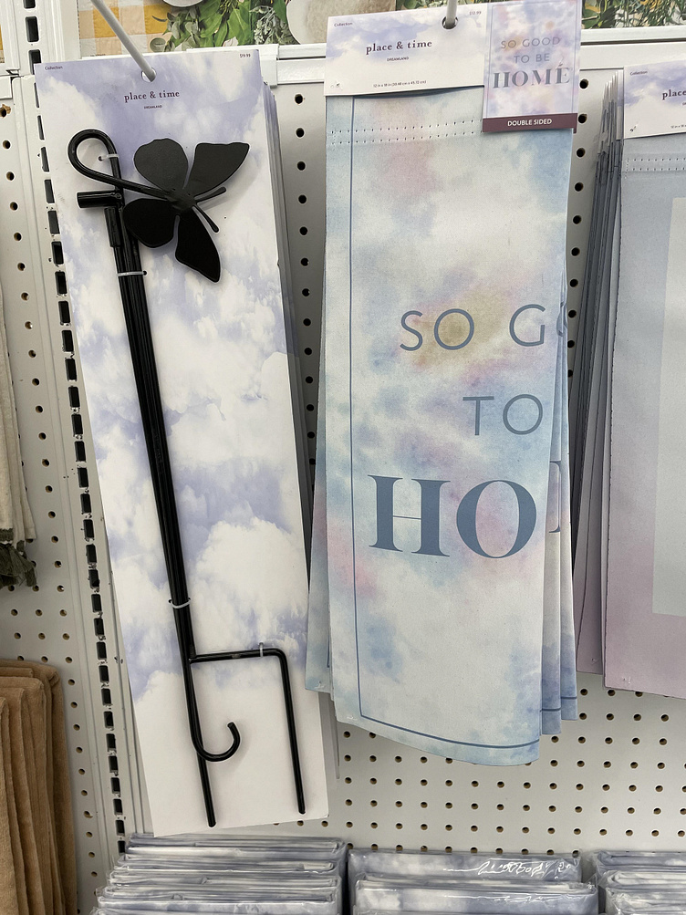
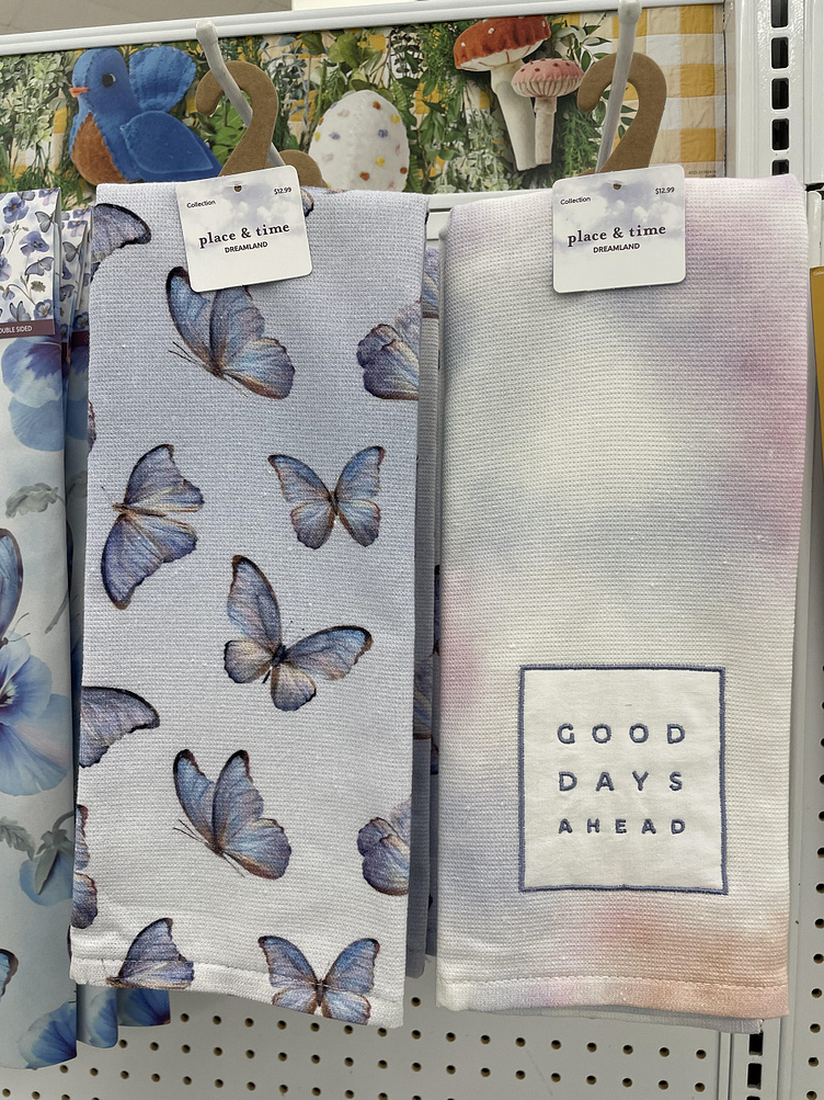
Dreamland was a new seasonal decor set launching for summer 2019 at JOANN Fabrics. The line's focus was based early 90's aesthetic.
Process
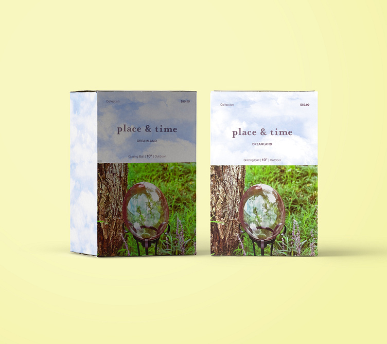
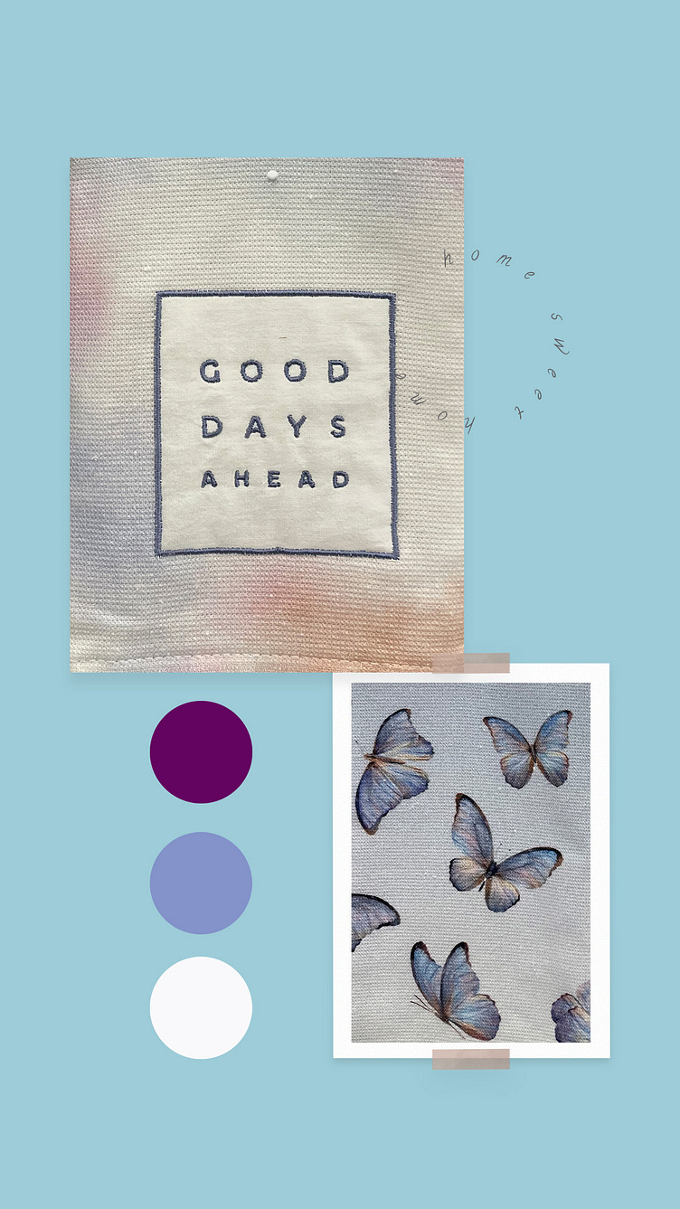
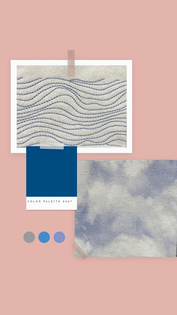
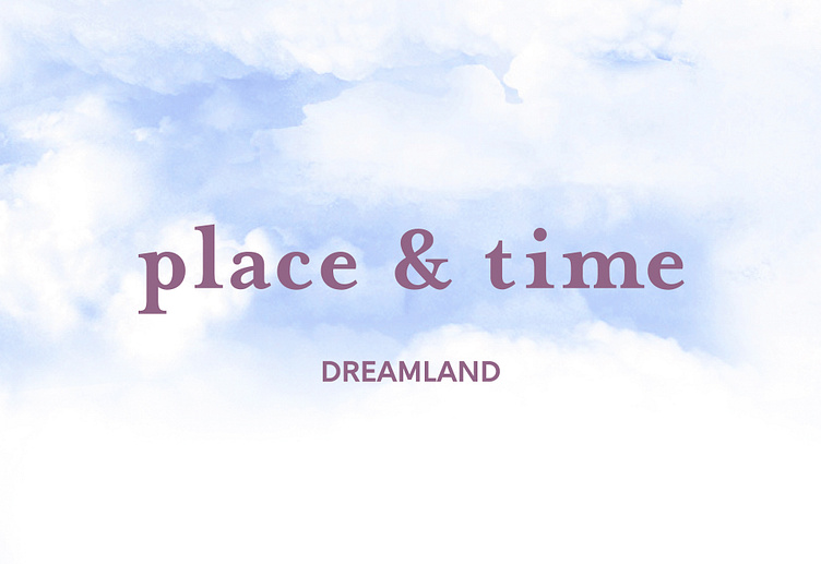
My approach to this project was to come up with a color scheme that built on 90's trends and complimented the colors and imagery in the product line-up. I began with curating mood boards and collaborated with buying, and product development teams. The color combinations were pale blue tones with deep navy and maroons. Once the color combinations matched the product development team's trends and vision, the design came together by applying a cloud pattern through out the packaging.
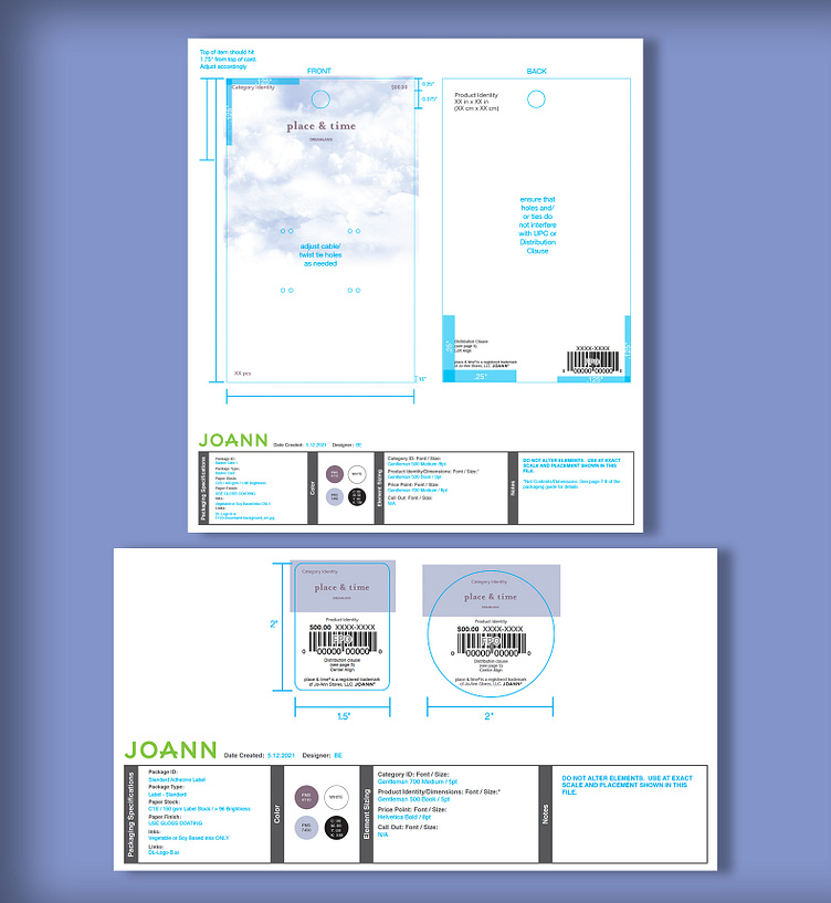
In the creative process, even though Joann Fabric only uses a soft matte finish on all packaging types, I decided to move forward with a gloss finish. This decision would help the light colors stay vibrant and to create a iridescent aesthetic that tied back to the products. Then, once approved, the final art was applied to various dielines and sent to vendors for their product creation process.
Solution
I reviewed and approved all packaging materials with multiple vendors, and was responsible for fact checking dimensions and legal warnings and call-outs for the final products.