S Logo Design: Crafting Simplicity and Sophistication
Hello Guys! 👋
Today I want to share with you my design exploration of the
S Logo Design: Crafting Simplicity and Sophistication
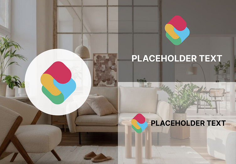
In the realm of logo design, the letter "S" presents a captivating challenge - how to encapsulate an entire identity within a single, flowing character. 🌀✨
Introducing our latest creation: an "S" logo that embodies both simplicity and sophistication. This design journey took us through twists and turns as we explored countless iterations, seeking that perfect balance between elegance and memorability.
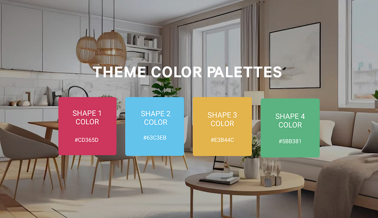
The sweeping curves of the "S" evoke a sense of fluidity and motion, while the clean lines add a touch of modernity. The minimalist color palette further emphasizes the timeless appeal, ensuring the logo remains relevant across diverse applications.
Tools used: Adobe Illustrator, endless cups of inspiration-infused coffee. ☕🎈
#LogoDesign #Typography #BrandingMagic #IdentityDesign #Slogodesign
What do you think guys? Feel free to leave your feedback in the comments section. Hope you guys enjoy it. Press "L" if you like it. Thank you! 😊
