Admin Panel / Analytics / Web App
Task
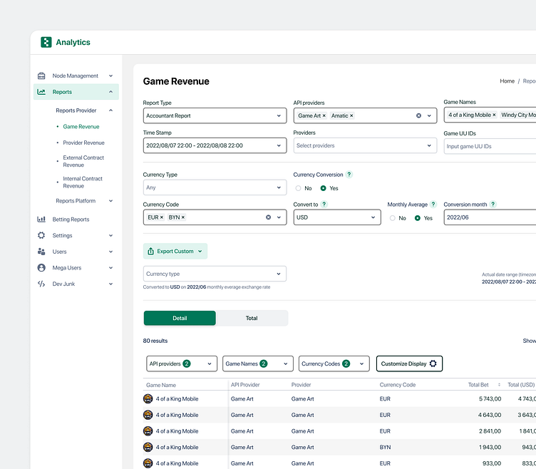
The task was to redesign the interface of the Game Revenue table in the service for providing reports on user gaming activity and financial indicators.
JTBD to the task: When I (Accountant) need to study the financial parameters for a specific period of gaming activity and generate a report, I want to simply and quickly display only the data I need (not all) so that I don't have to go back to the filters every time and configure them again.
Result
In addition to the horizontal scroll, 2 arrows have been added at the top of the table on the right as an additional ability to control the table. The lower horizontal scroll is made larger in height, with arrows at the edges for convenient interaction.
An additional ReportType selector has been added, where it will be possible to select a report type with a specific set of columns that are important for a specific role. There is also an additional "Customize Display" button above the table, which will allow you to create a custom set of columns.
Above the table there is an additional panel with filters that are most often changed by users (indicating the number of previously selected parameters): API Providers, Game Names, Currency Codes (according to a stakeholder research). With a large number of rows in the table, when scrolling down, the panel with filters is fixed and allows a user to change the parameters in the popular filters without returning up to the main section with filters.


