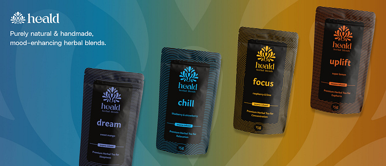
Heald Herbal Blends Identity & Packaging Design
About
Heald offers four all-natural, handmade herbal blends, each infused with essential oils (terpenes) to evoke a specific mood: Uplift, Focus, Chill, and Dream. Based on the belief that what we consume affects our emotional and physical well-being, Heald promotes personal development and mindful living. The products can be used as a relaxing tea, as a healthier alternative to tobacco, as a supplement for cannabis users, or as an aromatherapy aid. Heald empowers customers to shape their lives by controlling their emotional states. By leveraging the power of nature through Heald's blends, customers can enhance their emotional well-being, embodying the modern alchemist to create their desired life.
Audience & Brand Personality
Our audience includes herbal tea lovers, health-conscious individuals, and cannabis users. The key attributes that define the brand personality are: premium, elegant, natural, mysterious and effective. These served as guiding principles in all subsequent design and communication initiatives.
Identity Design
The brand's logo is designed with natural, fluid curves that draw inspiration from the organic world. Its interpretation is multi-faceted: some may see a verdant leaf, symbolic of the company's connection to nature and herbal products, while others might perceive the silhouette of a person in a meditative pose, their energy or aura expanding in a serene halo. This duality in design encapsulates the company's vision of harnessing nature's power for personal upliftment and evokes an innate sense of tranquillity and balance.
Packaging Design
The packaging design for each herbal blend effect was crafted with distinctive minimal line patterns and color accents. Each pattern corresponds to the intended mood: yellow concentric circles for 'Focus', symbolizing concentration; calming purple curves for 'Dream', suggesting sleep; energizing orange corners pointing upwards for 'Uplift'; and tranquil blue waves for 'Chill', indicative of relaxation. These designs set against a nearly black background give the packaging a premium, elegant look. In addition to these unique patterns, custom icons were created for each of the three primary uses of the herbal blend.


