Squared or not ?
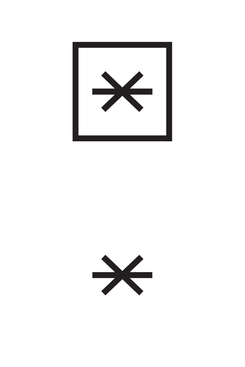
Hi all. I'm working on rebranding my girlfriend's company : Velvet Moustache (.ca) I have come to love the asterisk/cat-mustachs symbol we did, but I still don't know if It needs to permanently live in a square or not.
The reasons for the square are mainly because : 1. The flagship products of her company are the squared cushions (see the website) 2. It isolate the symbol from every other visuals that could live besides (for example : textile patterns, drawings, illustrations, etc) . Otherwise I feel it might appear as just a graphic symbol (which is our problem right now with the thinner logo)
Any thoughts ?
More by Benoit Massé View profile
Like
