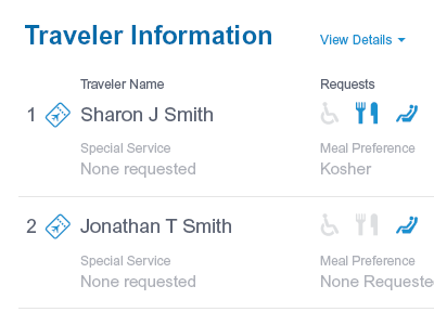
Traveler Information
redesigned the flight confirmation page's traveler information section because it was confusing as hell. goal is to show a quick overview to reassure the user that their information was entered correctly, with details available a click away.
part of a larger redesign that you can see on my site: http://jim-silverman.com/work/confirmation/
More by Jim Silverman View profile
Like


