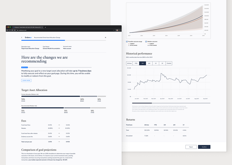
Endowus - redesign experiment
During my time with Endowus one of my responsibilities was to improve the user experience of their web investment platform. Part of that UX overhaul involved updating the UI to establish more repeatable patterns.
While in the final version the UI was a bit more vibrant and used a lot more of the brand royal blue, one of the experiments I did for the platform involved a fairly monochromatic colour scheme - still true to the brand guidelines I've established, but the goal was to create a newspaper-like experience and operate more with contrast and white space than with colour. The blue and accent colours were used to create focus points and display overlaying data instead of being applied to the main UI elements. Ultimately the concept was rejected due to the time it would require to be implemented.
