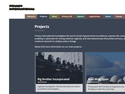
Privacy International Projects Page
After the homepage, each section has individual colours to bring the site to life and make it clear which section a user is in. Colour was used this time as their previous websites have been very muted (i.e. white and grey) or harsh (black and red) and they'd never used their report cover colours before.
Together with Privacy International, I spent a lot of time looking at the content and the information architecture to work out how many different layouts the site needed. This projects page is repeated again on the blog section as that also had images for each article.
The entire theme is based on delivering a MVP, which we will continue to evolve over the next few months. The first phase was to deliver a base theme, the next phase we're going to relook at the homepage and start pulling content through.

