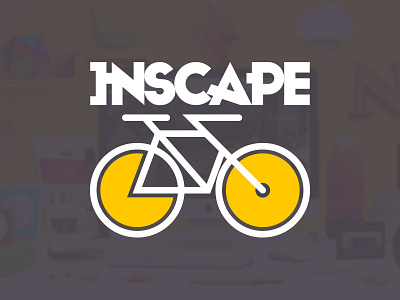
Inscape Go Logo
I designed this logo for a class project at Inscape.
We had to come up with a logo and mobile app design for the college.
I wanted to use a graphic representation of movement and acceleration, so I started by deconstructing the G and O into simpler shapes.
That brought me to the idea of using the circular shapes as wheels on a bicycle. I used simple, bold lines to emulate the geometrics of the Inscape logo.
More by Werns Diedericks View profile
Like
