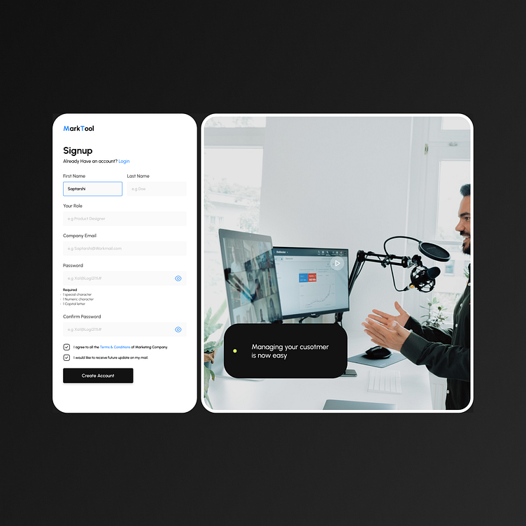
Signup page for marketing tool
This was the part of design challenge, you might notice that there's a video on the right its intended to explain how this tool will help its user, although its not always a good idea to have any video or animation while filling out a form as it diverts the user attention resulting in drop off but a simple video that might give the users a glimpse of the tool that will help might be helpful to increase in the signup rates.
More by saptarshi Samaddar View profile
Like

