Daily UI 022: Redesigning The Met's "Search the Collection"
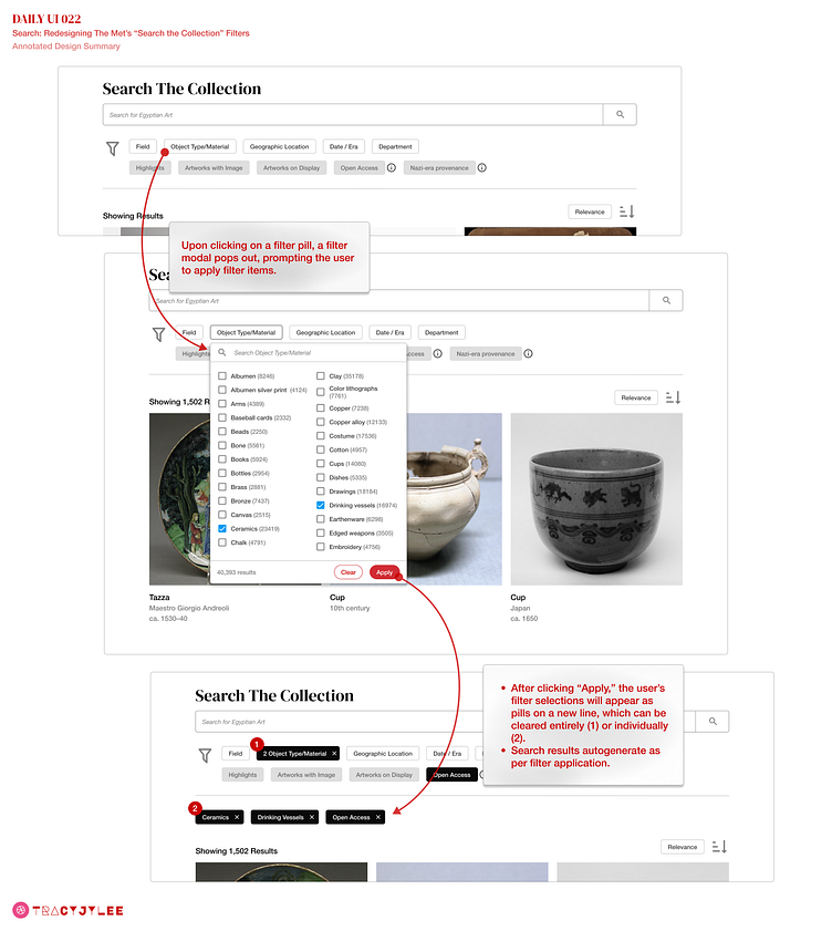
For today's prompt (design something related to "search"), I redesigned The Metropolitan Museum of Art's "Search the Collection" filters using filter pills and a pop-out modal, replacing the drop-down menu(s).
Since this exercise is all about UI, I was curious as to how much of the explanatory language could be replaced with familiar icons and indications of state and hierarchy through color/opacity.
Focusing on the user's interaction with the "Object type/material" menu, I was curious as to whether a pop-out modal with a list and checkboxes might convey that multiple filter items could be applied, versus the single-item-selection-nature of the existing drop down menu.
Perhaps this reads more as a report, than a display of ✨ flashy UI ✨ , but I find the simplicity to be just as appealing and so very important to streamlining a user's immediate comprehension of the page.
Does the UI support the UX? Let me know what you think!


