IPTS - Design System Case Study
Project Brief
The Interplanetary Travel Syndicate (IPTS) is a bustling transportation network that moves people between various planets in our galaxy. Management determined to start off with three distinct services:
IPTS Travel, an online platform where voyagers can browse and book trips in and around our galaxy;
IPTS.org, a website with the latest news and updates on the IPTS;
and IPTS Rail, a real-time web application where customers can view routes, lines, and timetables for various commuter lines.
The project's scope was to construct three websites, each with five shared components. To facilitate this, a design system was established that encompassed the visual language and the five components outlined in a reference site.

Research
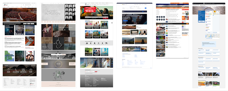
The study phase entailed looking into websites that provided services like travel reservations, underground railway commuters, travel news, and non-profit organizations connected to outer space. Snapshots were taken to analyze the shared elements and material for each service.
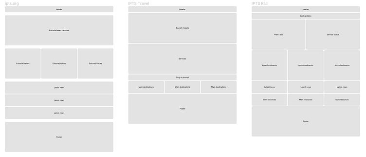
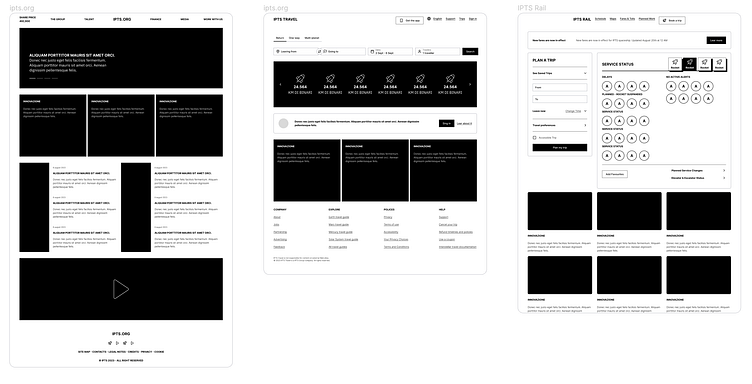
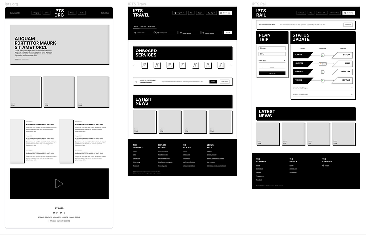
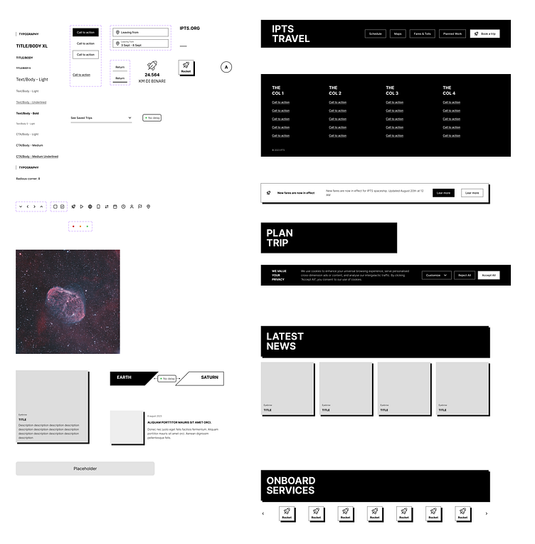
Wireframes
By constructing wireframes for the three website homepages, I was presented with a better understanding of the particular demands of each element.
I did 3 iterations of the wireframe, building little by little a first draft of the design system for common components.
Wireframe: 1st iteration
Wireframe: 2nd iteration
Wireframe: 3rd iteration
Design System: draft
Rebrand
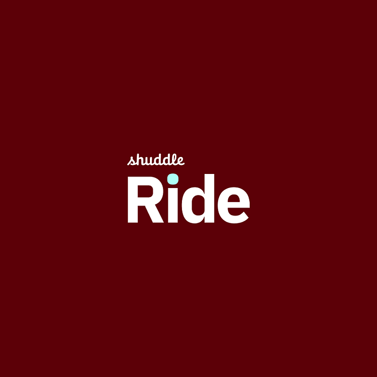
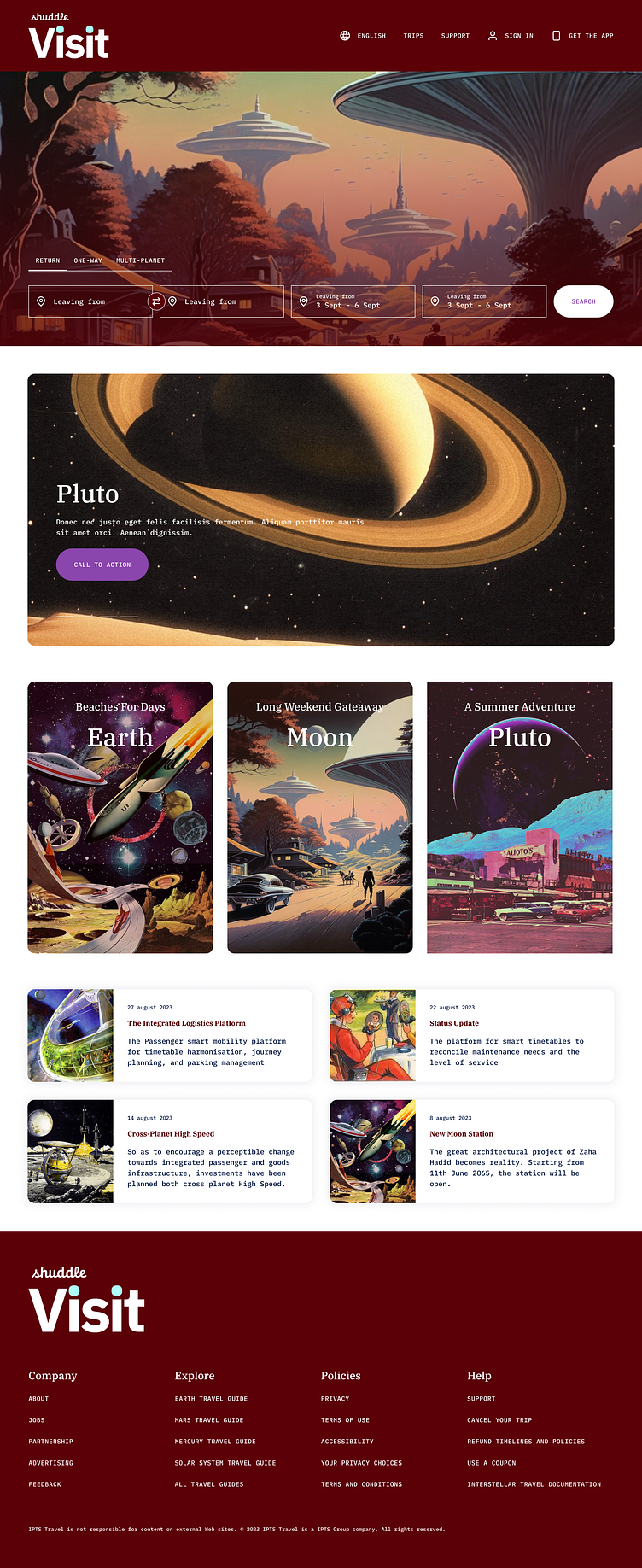
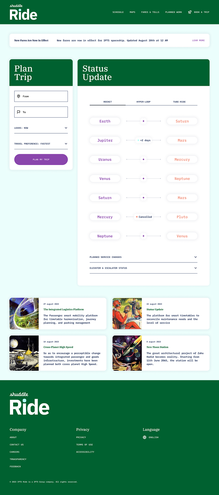
As part of the rebranding, the three products will now be known as Shuddle Travel, Shuddle.org, and Shuddle Rail.
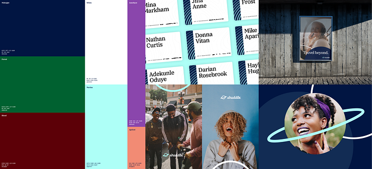
The Interplanetary Travel Syndicate (IPTS) has decided to hire a branding firm to revamp their organization, which includes updating the identity of their three products - IPTS Travel, IPTS.org, and IPTS Rail. Through focus groups, it was determined that the IPTS name and design felt too stern and intimidating, and the goal of the rebrand was to attract a younger demographic. After extensive research, the new name "Shuddle" was chosen, and the three products became Shuddle Travel, Shuddle.org, and Shuddle Rail.


The rebrand's documentation contained instructions such as: a new, lively color palette to be inviting; reliance on the IBM Plex superfamily for a wide range of options and familiarity; and, the use of lifestyle photography to attract a younger target audience, as well as depictions of humans in destination images to create a sense of being there.
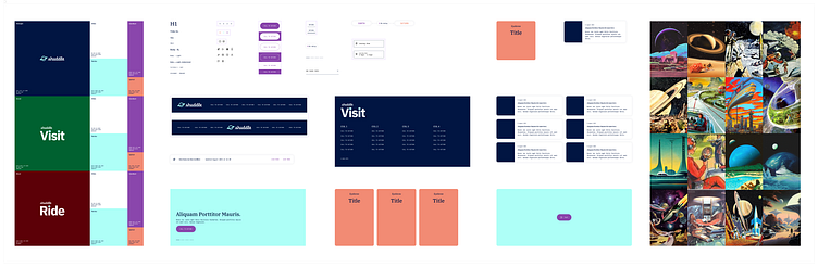
Design System Re-brand
Starting with the brand-new guidelines, the design system has been updated and expanded, making sure that the look and feel of the brand are consistent across all platforms.
Final designs
At the same time, starting from the 3rd iteration of the wireframes, the website was updated and refined, until the final version was produced. The website was constantly updated and refined, and the process was a collaborative one that involved everyone in the team (nop, just me).

Conclusions
Constructing the design for the three websites seemed wise. With so many parts overlapping, establishing the central components was the most difficult part. After that, customizing the appearance and atmosphere was straightforward.
Using the FIgma components, variables and styles speeds up the overall exercises. In real life work, I would have spent more time documenting each component, as well as refine their properties, states and related guidelines.
The most difficult part was dealing with the brand given to us. In a realistic situation, there would likely be more dialogue between us and the branding company to ensure that the given brand could be used effectively while still producing the same outcome.