Hello creative family.Here is my Freelance site called BlinQ
This is a practice site where I followed along with UX Designer Jesse Showalter on youtube. Please check him out on all his socials. He is an amazing designer and has been a huge help in my new journey in Web design.
I would love to have some tips and advice about this practice. Funny thing about me is that I try to make everything perfect and if I cant I'll never post any progress. So this is very new for me to ask for help but I know that pursuing any new career has their failures! So please give me your honest feedback. I love to learn and I definitely need wisdom.
Thank you so much for checking out my design. I hope you guys stick around for my future projects and we'll embark on an awesome journey together!

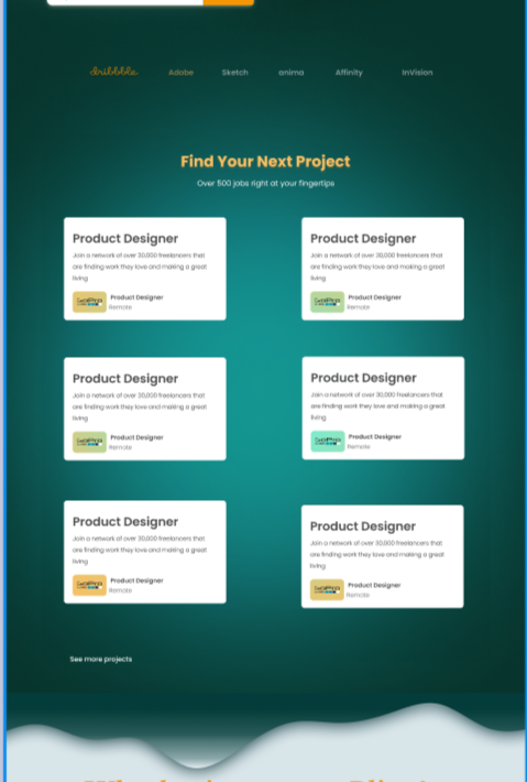
Here I was having a hard time choosing my color and I probably over used the gradient. Also auto layout has been a challenge for me sheesh. Anyway, looking back on this design I would use brighter text colors to create a contrast since the black is fading in the dropshadow. Please leave your thoughts on what you would do differently.

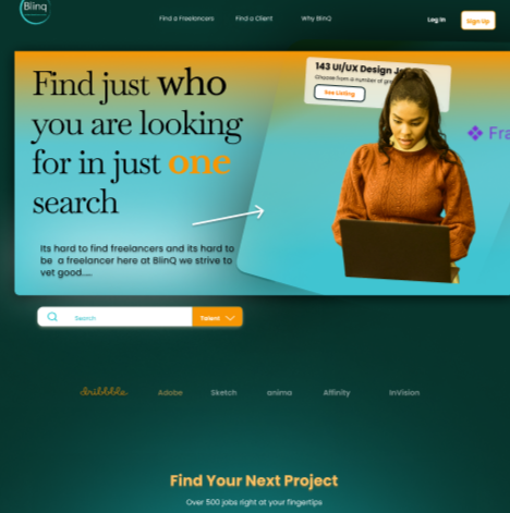
Update!!
I spent this week looking over this project and trying to make things more cohesive. Im so afraid of failing but I have to fail and learn to succeed. Below are my results. Feel free to leave tips and advice.