TranslateEase APP: Seamlessly Translating
Immerse in the Subtle Tones of Tranquility - Experience Beige & Brown Minimalism in Our Translate App Design.
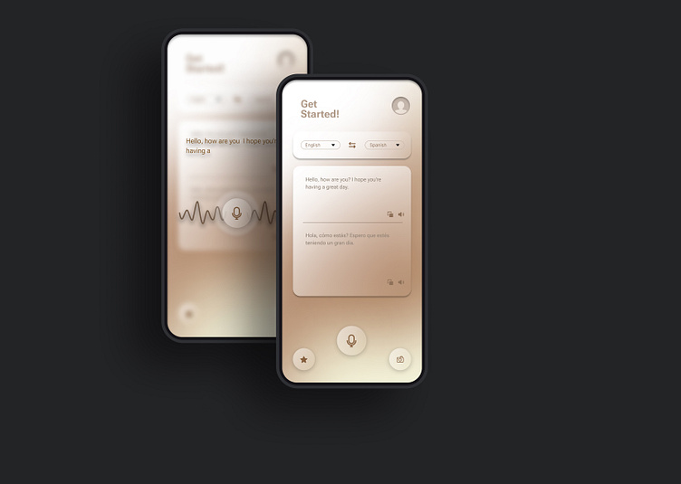
Discover a serene design palette with calming beige and brown tones. Experience minimalistic elegance that facilitates seamless language translation and transcends cultural boundaries.
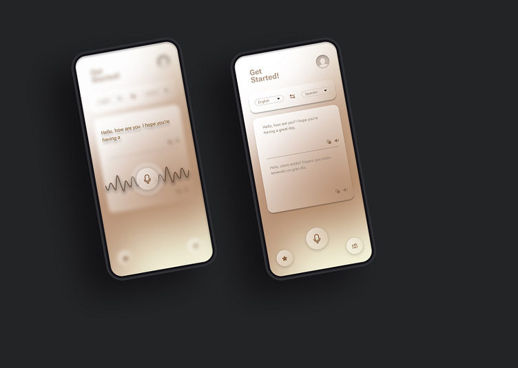
Language barriers often hinder global communication. Our design tackles this by combining minimalist aesthetics with intuitive translation, making cross-cultural conversations effortless and accessible.
Our team was inspired by the harmony found in nature's earthy hues. The beige and brown theme signifies unity, mirroring how languages unite people worldwide. We aimed to create an app that fosters connections through design.
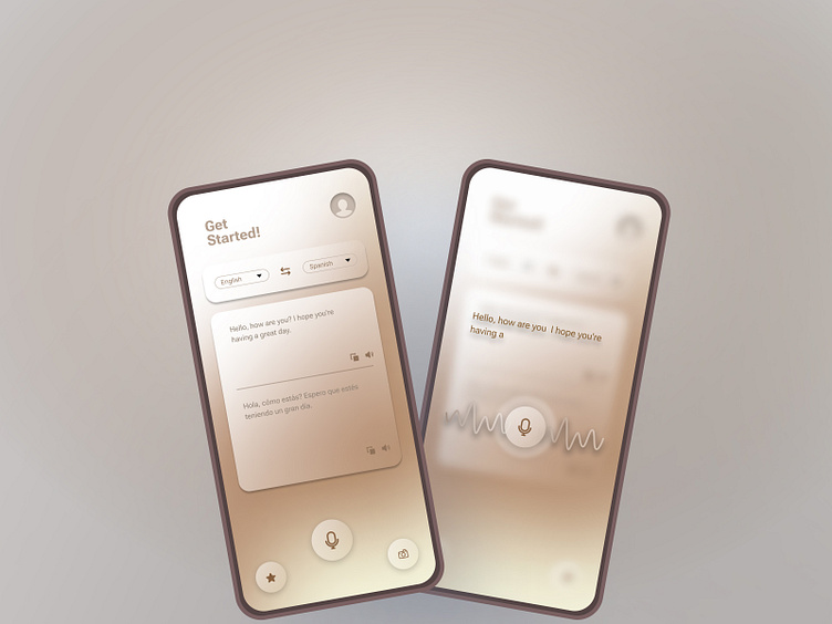
Achieving the right balance of beige and brown required meticulous color selection and testing. The UI elements were carefully designed to provide a distraction-free experience, ensuring user focus on clear communication.
What do you think about the power of minimalist design in breaking language barriers? Share your thoughts and join the conversation on how aesthetics can enhance functionality.
