Portfolio-Sample
I have considered some of the below points while re-designing my portfolio:
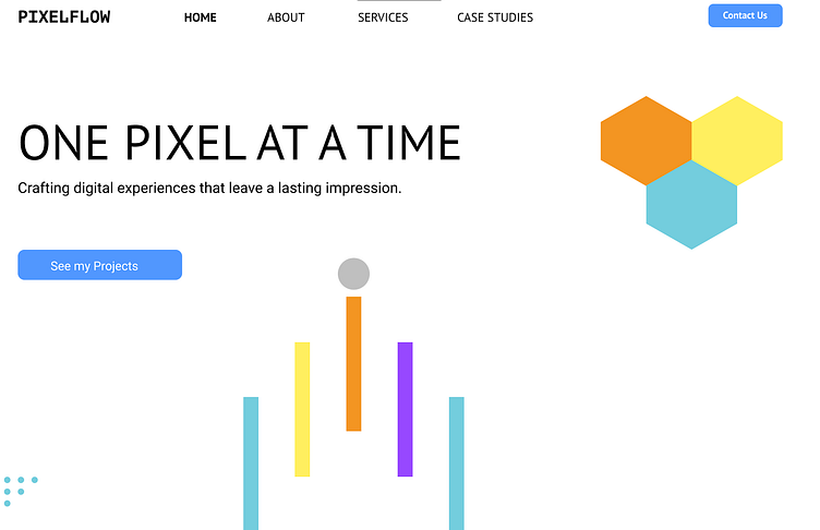
Inclusive Accessibility: The design prioritized inclusivity by adhering to Web Content Accessibility Guidelines (WCAG). Color choices, contrast ratios, and typography were carefully selected to accommodate users with varying visual abilities, ensuring a seamless experience for everyone.
Consistent Visual Identity: The design maintained a consistent visual language with the overall portfolio. By utilizing the same color palette, typography, and spacing, a cohesive and recognizable brand identity was established, promoting a sense of familiarity.
User-Centric Messaging: The tagline was crafted to reflect a user-centric approach. It instantly communicated the essence of the designer's commitment to creating experiences that cater to the needs and preferences of visitors.
Strategic Information Hierarchy: The content was organized hierarchically to guide visitors seamlessly through the section. Clear headings and concise descriptions enhanced readability, while the deliberate placement of the "Explore My Work" button facilitated effortless navigation.
Visual Cues and Icons: Icons were strategically integrated to visually convey the design principles. These icons acted as quick references, summarizing key attributes such as accessibility, consistency, and user-centeredness, effectively communicating the designer's ethos.
These considerations collectively shaped my design, fostering a welcoming and informative user experience that aligned with the designer's core values and principles.
