Daily UI Challenge #027 (Dropdown)
Prompt: Dropdown
Is it a menu dropdown? Or a tip that's dropped down during a tutorial? Or inside a software tool to show more features?
What extra information is displayed? The current price of gold? A login/logout button? Menu selections?
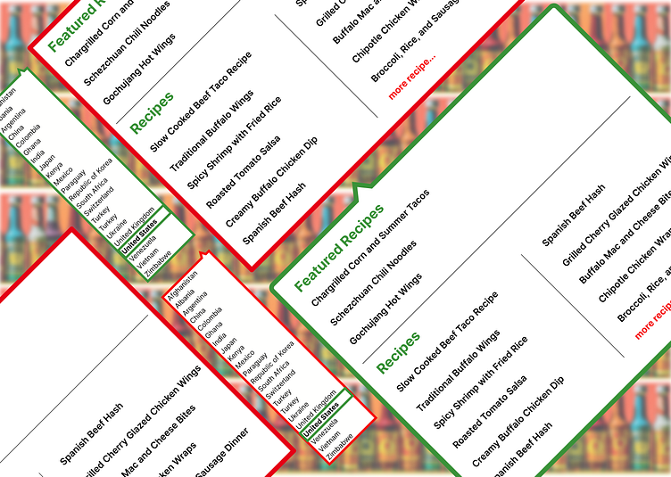
For today's UI challenge for drop-down menus, I decided to utilize one of my current case studies projects I'm currently doing some Hi-Fi iterations on. One of my P1s was the "Region Switching' which was spaced too closely and was visually too dark. I decided to go with a white interior filled with color typography strokes.
I also wanted to go more in-depth about what the website would offer, so I went ahead and created a drop-down menu for the "Recipes" tab. Showcasing Featured and additional recipes. An added "more recipes..." was added to take users to the full recipes page as well. Overall very simple, clean and easy to read.


