Biscuit Package Re-Design
The task was to select a supermarket item with unnecessary packaging, and re-design it to be both more appealing and more eco-friendly.
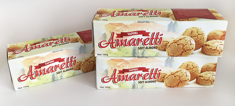
The new design (the box pictured below right) does away with foil and unneccessary space, and uses all recyclable materials instead, rendering the pack far more environmentally friendly.
The fresh design, featuring one of my own digital paintings of Italian countryside, gives the product a unique and bright appearance that allows it to jump off shelves in a supermarket.
(Above: the old packaging shown left, and my re-design shown right.)
More by Chelsea Handley View profile
Like


