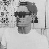
SPACED OUT — IPTS' Design System Story
As part of Dribbble's Scaling Design Systems course, the assignment required that I'd create a Design System that could feed 3 different products.
The Brief
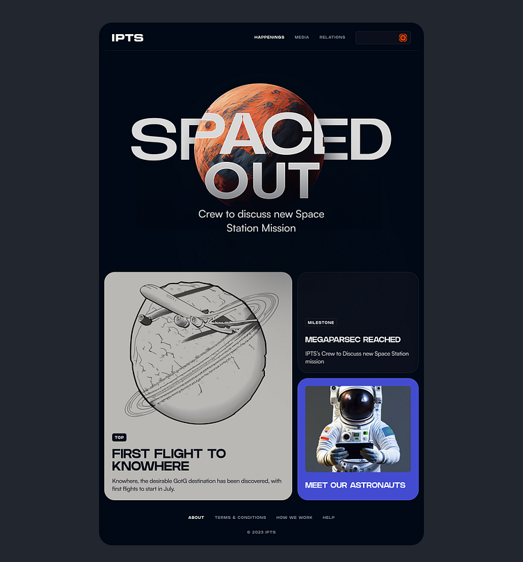
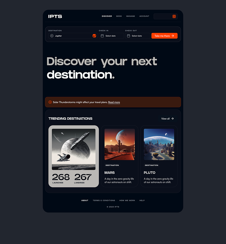
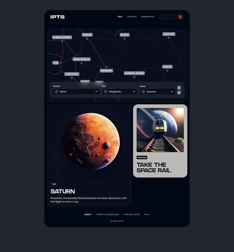
As Head of Digital for the newly launched IPTS: the Interplanetary Travel Syndicate, a bustling transportation network that shuttles people from world to world within our galaxy, I am responsible to create three websites, all with three unique offerings.
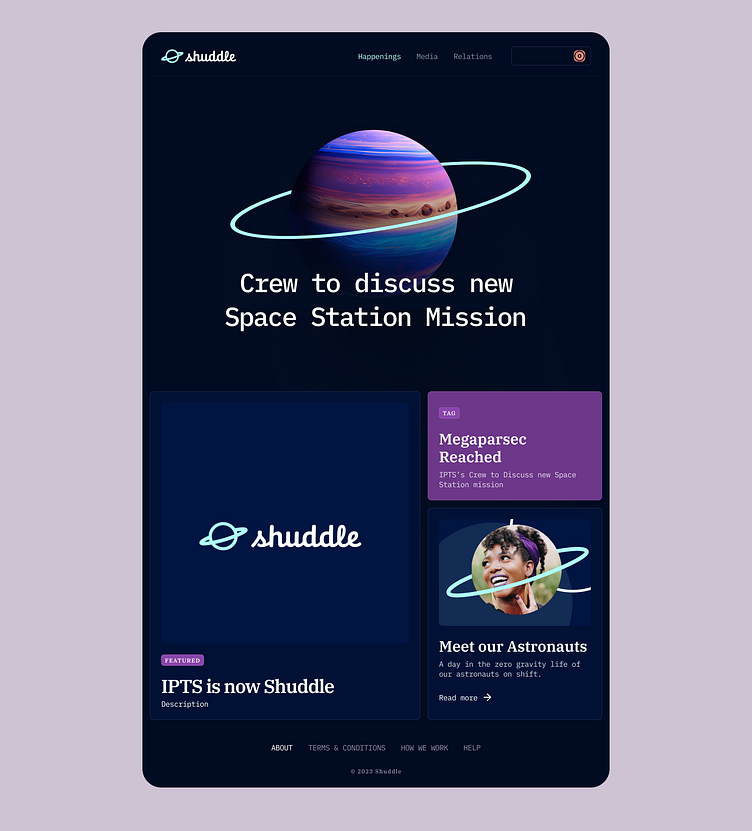
ipts.org, an informational website where you can find the latest news and happenings with the IPTS
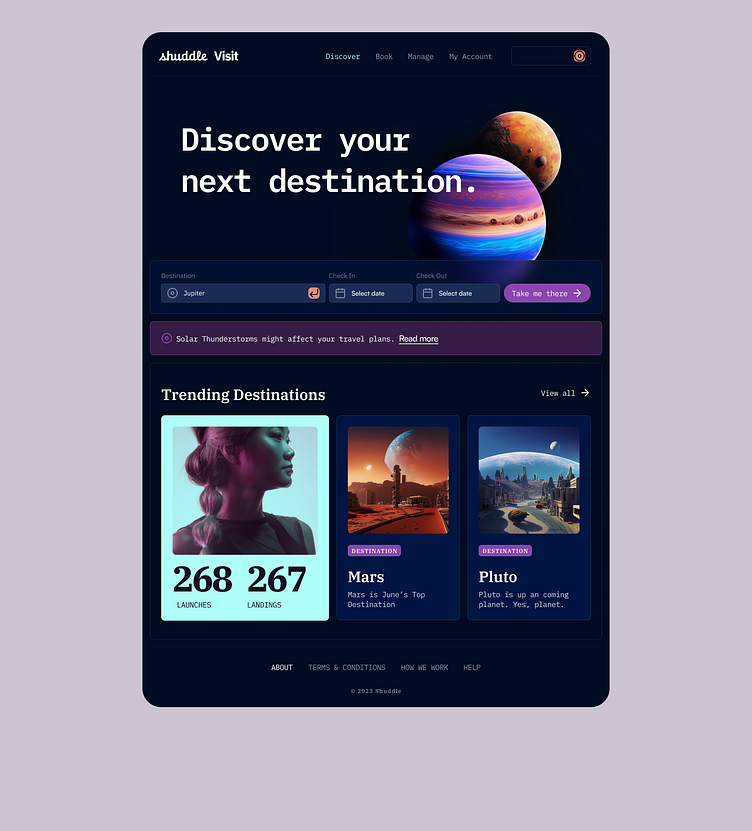
IPTS Travel, a website where you can browse and book travel to and from multiple destinations within our galaxy.
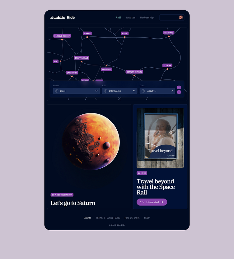
IPTS Rail, a real-time updated web app where you can view lines, routes, and times for all the different commuter lines.
To do this efficiently, I have built a design system in Figma that will help feed into all 3 products, minimising my workload and allowing me to quickly make changes across the products.
The Experience
Before I started implementing a design system, I needed to figure out what the product would look like.
My vision of IPTS was one that was futuristic and mobile. The user should be able to navigate the product with ease and on the go. This made me realise that tablets would be the ideal device to navigate on, as they're easy to carry, and would be supplied as the main device in spaceports and flights.
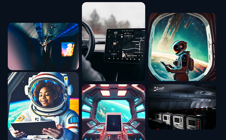
Wireframing/IA
In order to distinguish what components I would need to build, I needed to decide the structure and architecture of each product which allowed me to identify components that would be required.
To do this, I've applied something that I've learned during the course, which suggests that an element should be turned into a reusable component only if it was required 3 times or more.
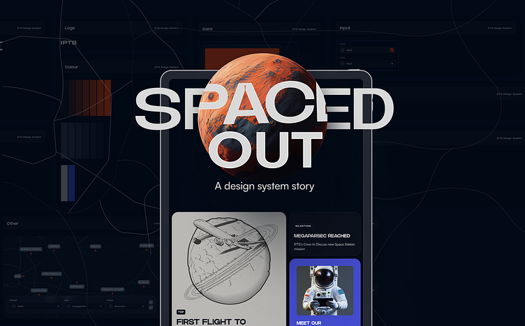
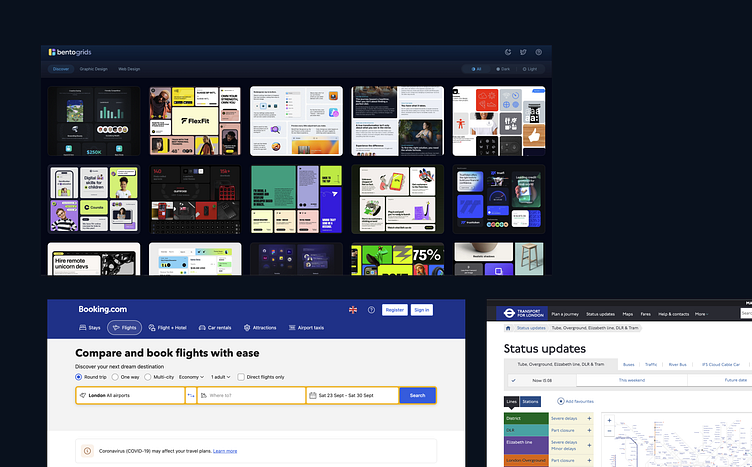
Research/Inspiration
My 2 main inspirations were dashboards, as seen in spaceships or other vehicles and wanted to apply bento grids when structuring the information.
"The bento grid, often resembling a bento box layout, is a UI component that compartmentalises information into distinct sections for clarity and organisation"
This means that it would be the ideal way to display necessary information that would be easy to scan and digest.
My other two sources of inspiration were Booking.com and Transport for London.
The Product
With enough research and with a plan in mind, I've started designing, and ended up with the 3 products.
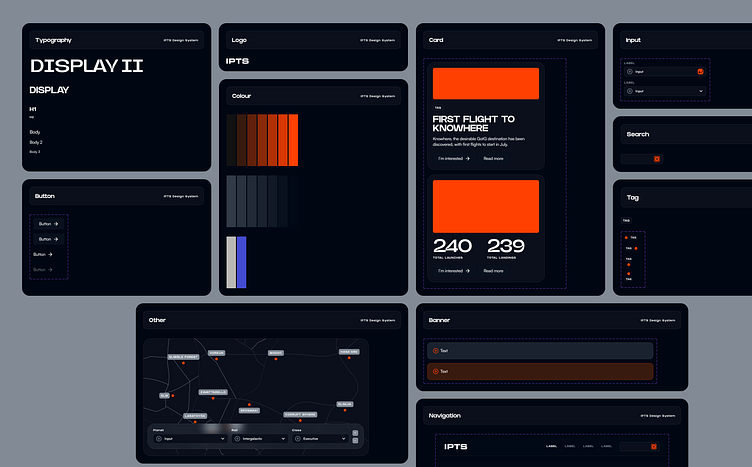
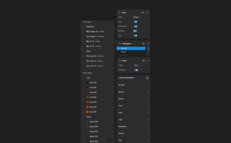
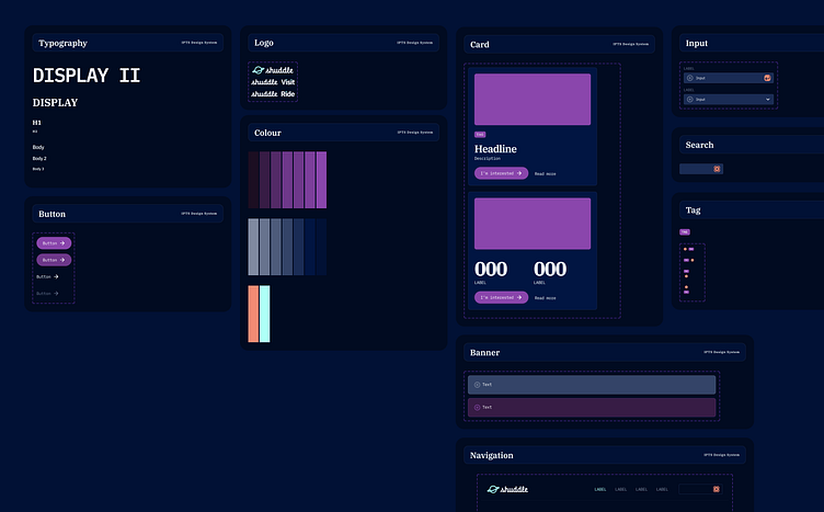
The System
The System was composed of the following components, and would allow me to quickly build for every requirement of each product.
• Typography
• Colour palette
• Logo
• Button (Primary, Secondary)
• Card (2 variants)
• Navigation (Top, Bottom)
• Inputs (Text, Select)
• Search
• Tag
• Banner
The Rebrand
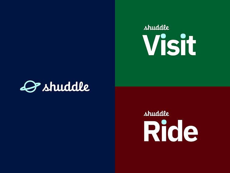
The leadership at the IPTS—the Interplanetary Travel Syndicate—just hired the prestigious branding firm MegaBrand to do a rebrand of the entire organisation, and there are a few things that’ll affect the three products I've been working on.
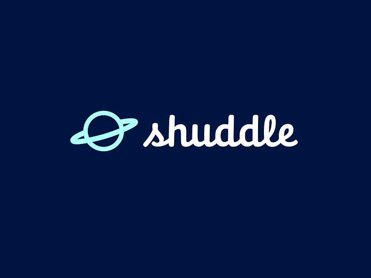
MegaBrand discovered through focus groups that the IPTS name and logo felt very ominous, like it was cold, faceless corporation that was always watching.
After weeks of research and exploration, they’ve settled on the new name “Shuddle”.
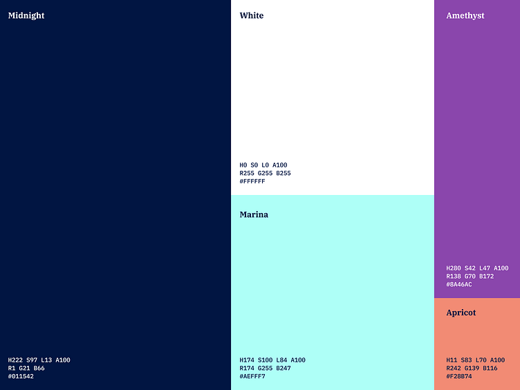
The typographic palette relies heavily on the IBM Plex superfamily.
The 3 main products have also been renamed to feel more like a family of products instead of independent offerings:
“ipts.org” is now “shuddle.world.“
“IPTS Travel” is now “Shuddle Visit”
“IPTS Rail“ is now “Shuddle Ride“
As part of this change, I needed to update the products to this new branding and to reflect the new brand, both in design and content.

Updating the System
The first order of things, updating the system.
My first worry was that the product was designed with a concept in mind. It was designed to be modern, simplistic, dark, futuristic, with effects reminiscent of the dark space, and it's meant to be serious, aimed at a mature audience.
Shuddle was anything but. It's lighter, more fun, aimed at the younger generation. Would a simple change of tokens be enough? Would the combination of colours match? Would it be accessible and make sense?
Time to dive in.
Initial reaction? Still quite dark. Though MegaBrand thought that it's important to maintain some familiarity. While it's important to consider a new user base and audience, we need to make sure that our existing one isn't forgotten.
Changes in copy and assets would bring the new brand to life.
Takeaways
Designing without considering components is less restricting and gives room for creativity.
Components help with keeping things consistent and forces you to reuse items instead of focusing too much on building new things from scratch, unless necessary.
A design system won't be the solution for a full rebrand, but it will make things easier. A rebranding isn't just about colours and typography. It's about the style, colour rules and their combinations, the harmony of the elements within the page, the voice and tone, among many other things, so while a design system can help quickly apply some changes, products will require whole redesigns to allow for the adaptation of all these changes.
Making changes means you need to constantly check if anything got broken in the process. Consistently QAing is key.
You may need more variants and tokens to make up for the addition or the lack thereof.