IMPEXO | TRANSPORT LOGO DESIGN & BRAND IDENTITY
IMPEXO LOGO DESIGN PROCESS
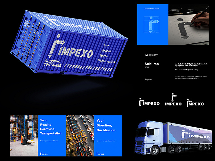
Embark on a journey through the artistry of our logo design process. With the letter 'i' cleverly reimagined as a road sign, the Impexo emblem becomes a compass guiding us towards uncharted realms of innovation. The 'i' symbolizes our unwavering commitment to exploration, while the road sign motif represents the pathways we forge in the business landscape.
As each curve is meticulously sculpted, the logo comes alive – a testament to our brand's dynamism and forward momentum. Just as a road sign directs travelers, our logo leads us into new dimensions of creativity and possibility. Join us in celebrating the birth of a symbol that encapsulates the essence of Impexo: pioneers of the unexplored, visionaries of progress. #ImpexoLogoJourney #NavigatingInnovation"
BEHANCE LINK :https://www.behance.net/gallery/177263285/IMPEXO-TRANSPORT-LOGO-DESIGN-BRANDING
To Avail Our Services:
Visit Our Website: https://wedigitalhub.com/brand-identity-logo-design.../
Call Us: +91-70036 34453
Whatsapp: 070036 34453
