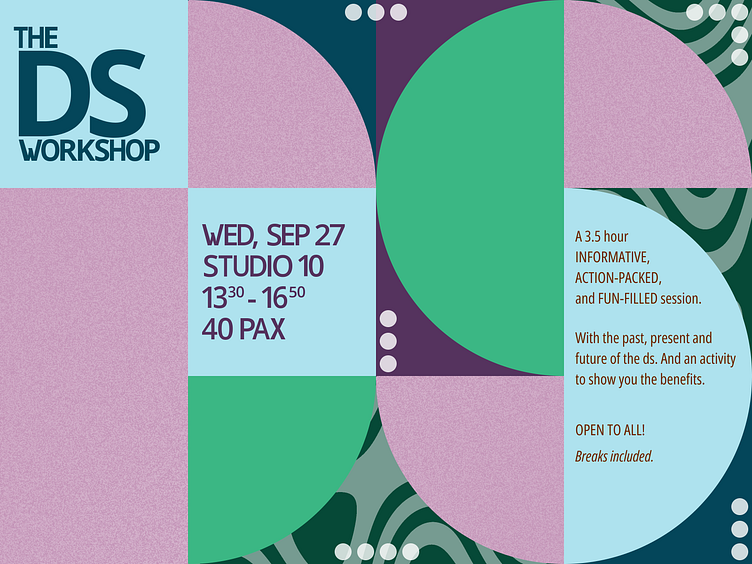
Poster - 1
Just wanted to create something for the workshop that the team will be giving in September. This took me 2.5 hours.
Inspiration
I googled "poster for design workshop". Found some inspiration. And started creating something from there.
I tried to stick to the foundations from our design system, tweaked some things a little bit. Like the typography. I hated the way W looked, so I had to edit it. Still not what I wanted, but better than the wider one. And the X. Come on. Why do these 2 letters have to be so wide.
Then added some noise.
Tool
Figma, through and through. Was too lazy to open illustrator.
Feedback
With the help of my colleagues, who have more visual design experience than I, I got some feedback. This is not the final result. But up until this point, it was just me working on the poster.
We changed the typo to something more appropriate for posters. Adjusted the circle accents. Added depth to the tiles by adding some noise and shadows.
