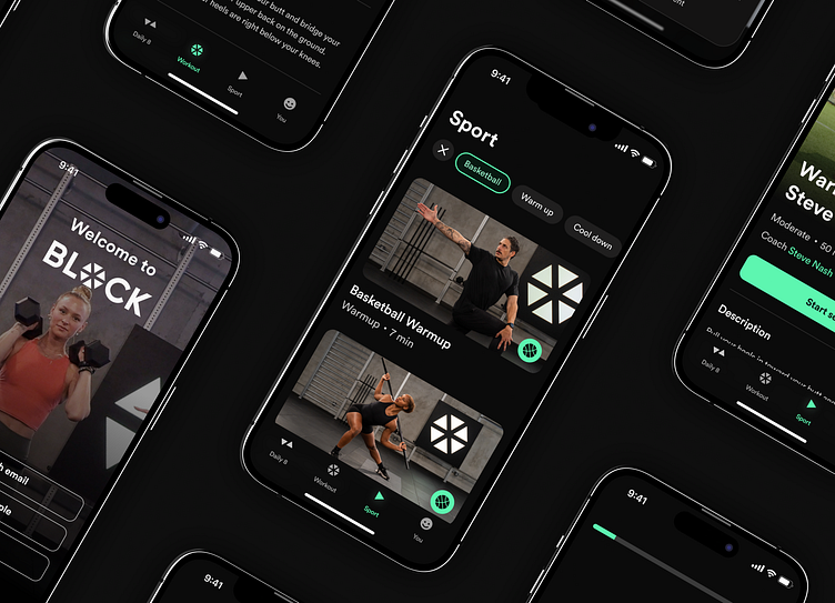
Block Training: Extending healthspan through movement
As the global landscape increasingly leans toward sedentary habits, the quest for comprehensive movement training solutions has never been more urgent. Block, envisioned by Steve Nash, discerned this paradigm shift and sought to connect the dots between stagnant routines and sustained, purposeful physical activity. However, the initial design and implementation of the app was limiting Block from pursuing this vision. With a noble mission in place, Block joined hands with our team to reshape the entire application experience, not just aesthetically but in functionality and scalability.
The Client: Block
Block, under the leadership of founder Steve Nash, sought to transcend the typical fitness app paradigm. They aimed to promote a lifestyle of consistent, mindful exercise.
"Your healthspan is the healthy years you have in life, and I'm obsessed with showing that everyone can use movement to extend those years. BLOCK will help people move better, feel better, and live better."
Steve Nash Founder of BLOCK Training, NBA Hall of Famer
Challenges:
Block faced several critical challenges that required a comprehensive approach:
Simplifying the Signup Process: The signup process was identified as the most significant bottleneck. Its complexity deterred potential users and affected the conversion rate.
Modernizing the Design: The initial app was unintuitive and designed with outdated practices. We needed to modernize and simplify the user experience to make it poised for future growth.
Rapid product evolution: Time was of the essence. Block needed swift changes and agile approach to remain competitive and relevant in the fast-paced fitness app market.
Tooploox's Approach:
At Tooploox, challenges inspire innovation. Despite the demanding deadlines, our momentum was unyielding. Leveraging our repository of expertise and prowess, each phase was methodically strategized and executed, ensuring that the pace was consistently brisk and the quality unparalleled.
Simplifying the Signup Process
Redesigning the signup process for the Block app was a crucial step in enhancing user experience and driving higher conversion rates. We analyzed the existing flow to identify areas where users might face confusion or barriers. Our redesign focused on simplifying and optimizing the process, reducing the number of steps and providing clear and concise instructions.
To further personalize the experience, we added a brief survey that allowed users to share their fitness preferences and objectives. This information helped us tailor the in-app experience to each user, making it more engaging and customized.
As a result, the signup process became significantly more user-friendly, leading to increased engagement and setting the stage for a more enjoyable experience within the Block app.
Modernizing the Design
In redesigning Block's app, our goal was to create an interface that was not only modern and user-centric, but also to deliver an adaptable and scalable app, capable of accommodating future features and growth.
We approached the design holistically, beginning with an understanding of the app's goals, target audience, and their needs. We deconstructed the application and rebuilt it from the ground up. Starting with the foundations, we updated the typography, color styles, and iconography for better contrast and accessibility, ensuring that all users are able to fully utilize the app.
We then thoroughly examined the app's features and removed any unnecessary components that did not support users in reaching their goals. This approach streamlined the app, making it both intuitive and scalable, and enabled us to implement it efficiently. As a result, Block can continue to expand and innovate focusing on what’s really important: users needs.
Partnership with Block
The partnership between Tooploox and Block was founded on open communication and a strong alignment of values. We became trusted advisors to Block, guiding them through the complexities of transforming their app into a user-friendly and engaging platform. Our multidisciplinary team brought a wealth of expertise to the table, allowing us to tackle every challenge with a holistic approach. As a result, Block was able to leverage our insights, experience, and cutting-edge technology to make informed decisions that significantly enhanced their product.
The benefits of our collaboration extended beyond the project itself, leaving Block with a solid foundation for future growth, a deeper understanding of their target audience, and the tools needed to continue delivering value to their users.
Block is now available on AppStore.
Let's collaborate hello@tooploox.com
Press ( L ) if you like it 💜
◗ ⬥ ● ■ ▲
tooploox.com ⬩ Behance ⬩ Linkedin ⬩ Instagram


