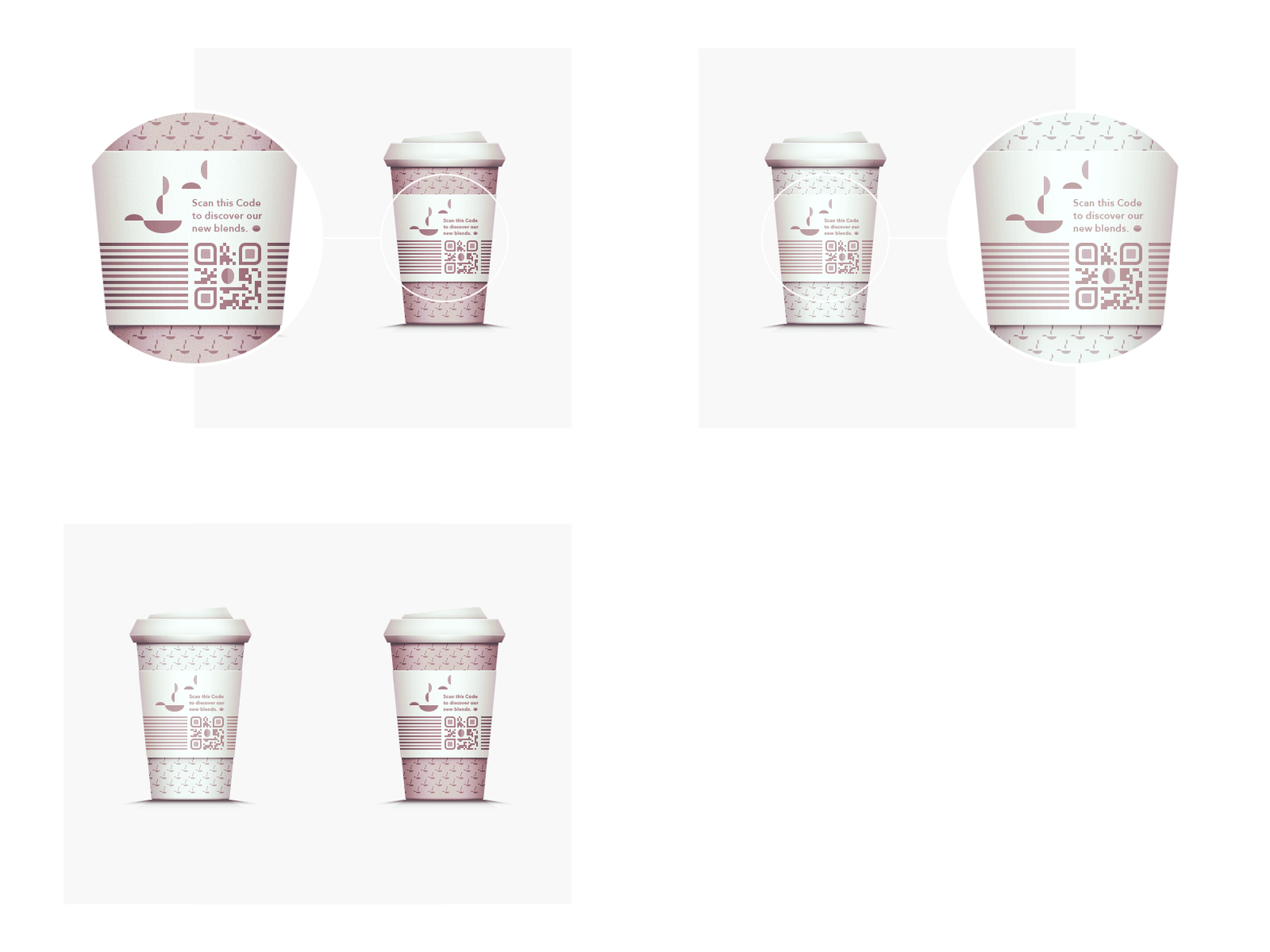
QR Code Visual
Hey there everybody,
sorry for the reupload, but I noticed some mistakes in the previsous shot, which was shot right before leaving the office, soooo yes, never do things in a hurry.
A little bit of context: I recently went back into a visual style I used to work in in my early days on dribbble (most is deleted :P), which tries to mock reality much more than my newer stuff, but without becoming photo-realistic or anything too 3D.
So currently I'm developing some vector based visuals that we are going to utilize in the near future in several usage scenarios, such as advertising or a campaign catalogue for our clients. Or, it will be used on our website.... Things have just started and might change.
However I wanted to show you these two buddies that differ in some details and might be worth checking that @2x option. The idea basically is to show how you can incorporate a QR Code in an more attractive way than just printing it on a sticker, etc.
Thank you very much for your attention - have a great day.
