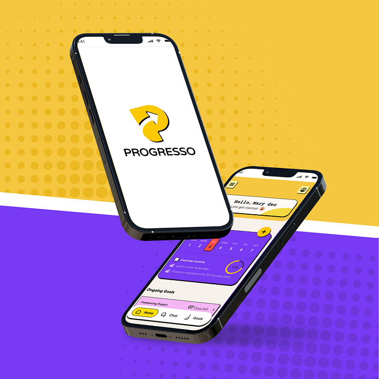
Progresso - The Neo-Brutalist Goal Motivation App
We wanted to create a mobile app around the theme of simple goal motivation. People find it really hard to maintain consistency around forming a routine, keeping track of goals and getting them done. An often neglected area, there is still some research on this topic.
We also found out that youth form a large percentage of those who want to get things done but don't know how. So we decided to try neo-brutalism as the UI approach!
The UI approach being finalized, the research in place, we started our usual process of creating an information architecture...
We started wireframing a basic mobile app flow, keeping in mind features which were planned in our application structure. The plan was to keep the screens at a minimum...obviously...if a goal motivation app has too many screens what's the point right?
Our first UI challenge was to setup a scheme based on neo-brutalism and yet achieve an accessible interface. The splash screens seemed a good place to start.
The homescreen was especially tricky due to the usage of vibrant colors, high contrast and bold type faces. After a lot of trial and error, a specific shadow style and color library was chosen to style the homescreen.
Once the homescreen was done, the remaining screens seemed like a piece of cake...but we decided that we needed to be creative in small places like consultant profile pictures, alerts and so on.
Once the homescreen was done, the remaining screens seemed like a piece of cake...but we decided that we needed to be creative in small places like consultant profile pictures, alerts and so on.
Once we were done...we asked a question which really put a different kick into the UI...can this app have a dark mode? If this is so deeply constrasting, can we have a "bright" mode instead? So we tried it...
We learnt a lot making this fun app! Hope you like.
Feedback and interests are welcome!


