Fiszky - Web Design UI/UX 🎓
Web Desgin App UI/UX for Fiszky 🎓
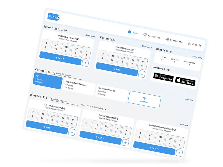
Fiszky is a groundbreaking learning system that personalizes the memory retention process 🧠. Users have the ability to craft their unique sets of flashcards, categorized by various subjects and divided into five levels of familiarity 💡.
Colors and Aesthetics
An clear and user-friendly design, marked by primary blue and white shades 🎨. The look is inspired by purity and freshness to aid in concentrating on learning.
Structure and Navigation
Categories: Users create flashcard categories tailored to their needs 📂.
Flashcard Sets: Within categories, various sets can be created 🗂.
Levels of Familiarity: Each set consists of 5 familiarity levels, assisting in tracking progress 🌱.
Features and Functions
Intuitiveness: A sleek, elegant user interface that’s distraction-free, enabling rapid addition and review of flashcards 🏃♂️.
Customization: Ability to modify content and structure according to individual user preferences 📝.
Learning Support: Quick browsing and quizzing facilitate efficient learning at a pace matching user progression 🎓.
Conclusion
Fiszky is an innovative product making learning quick and enjoyable, offering an intuitive and aesthetic user interface. The blue and white color scheme adds serenity, aiding focus on learning. Ideal for anyone who wants to learn efficiently and with pleasure 🚀.


