Website redesign with explanations (1)
Hi!
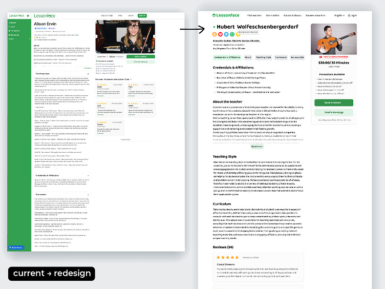
Found an exciting website. A service to provide lessons in playing musical instruments with tutors online. I didn't like the interface and decided to improve it. I only improved the tutor's personal card, making it cleaner, more pleasant and user-friendly.
Also decided to change the logo (site owners, no offense to me for this) and draw one advertising graphic banner since I already have a cartoon character. As for me. He stylistically perfect here.
Scroll down the slides in my shot.
More by Taras View profile
Like


