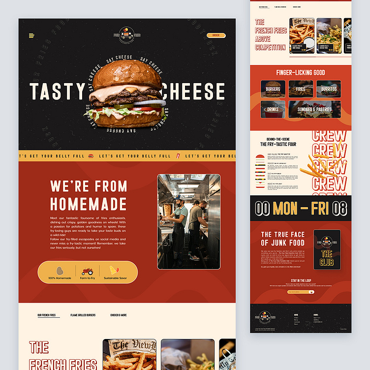
Four Fries - Food Truck
Hello you guys!
Long time no see right?!
That's all good, I'll make it worth the wait!
Meet this awesome food truck called Four Fries!
This landing page is a captivating blend of retro aesthetics and modern design, combined with bold typography and a splash of humor.
This case study delves into the innovative approach behind the interface, showcasing how it seamlessly captures the essence of the food truck while enticing customers to indulge in a unique and delightful culinary experience.
With rich shades of mustard yellow and deep burgundy, these colors are thoughtfully juxtaposed against clean, minimalist backgrounds, bringing a touch of modernity to the design.
This harmonious fusion creates a visual journey that transports users to the past while keeping them firmly rooted in the present.
Clever taglines and puns strategically placed among mouthwatering images of fries evoke smiles and connect with visitors on a personal level.
The ultimate goal was to convince visitors that Four Fries is not just a food truck – it's an experience worth savoring.
Hope you guys will like it!
Any thoughts on this? Eager to read them where they belong!
Still not following me?
Here is the link to make your day better @weare_wildstudio
Thanks a million for your support and feedback.
Stay green, cheers! 🌲
