Redmaids' High School Branding
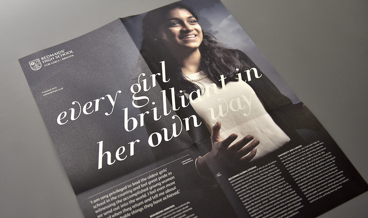
A merger of two schools in Bristol required them to seek a rebrand. Given the sensitive nature of the situation, it was paramount to respect the values and heritage of both schools to create a brand that has a strong sense of modernity, unity and progressiveness.
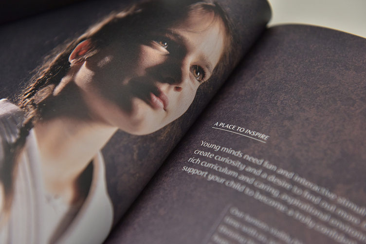
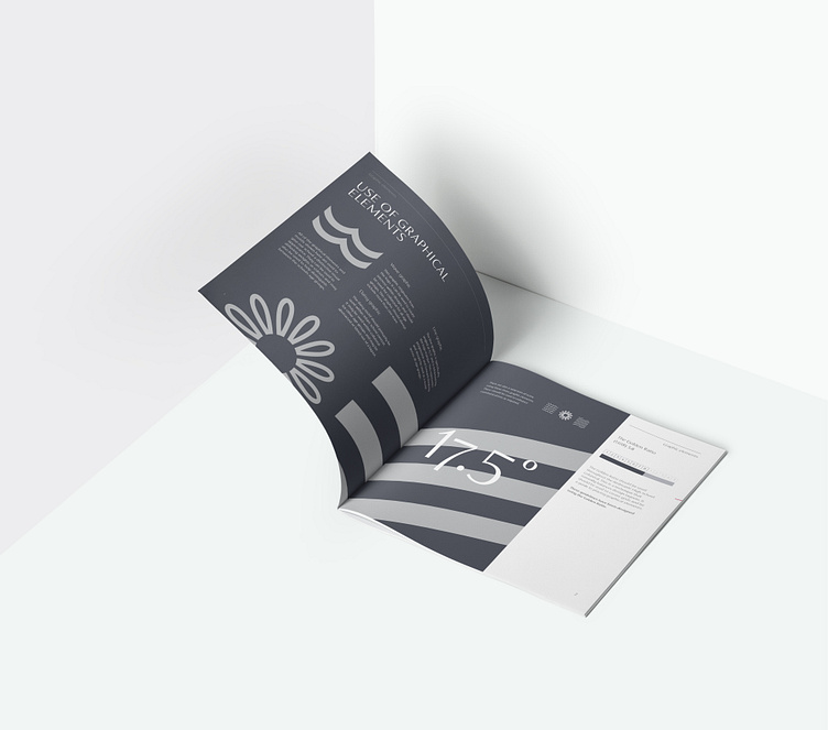
Collaboratively working with Ice House Design, we worked to blend elements from each school's heritage to create a new brand identity that celebrated their shared values and aspirations, reflecting their combined educational journey. The result was a compelling brand that resonated with students, staff, and the wider community, inspiring a collective sense of pride and fostering a forward-looking mindset.
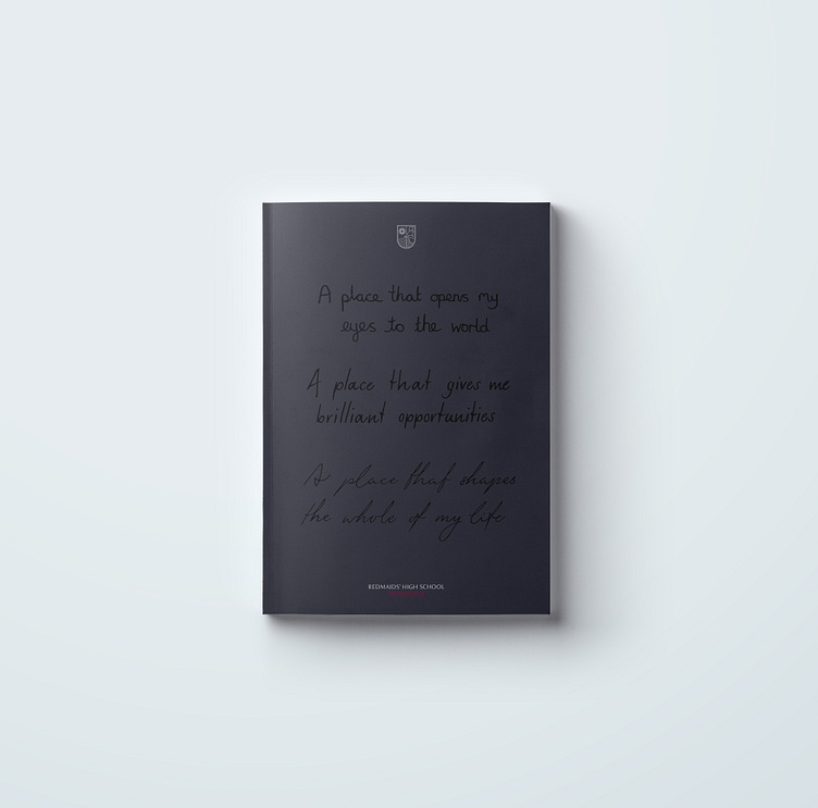
To accompany the rebrand, I collaborated with Ice House Design to create a comprehensive prospectus pack, which included the main school prospectus and supplementary materials.
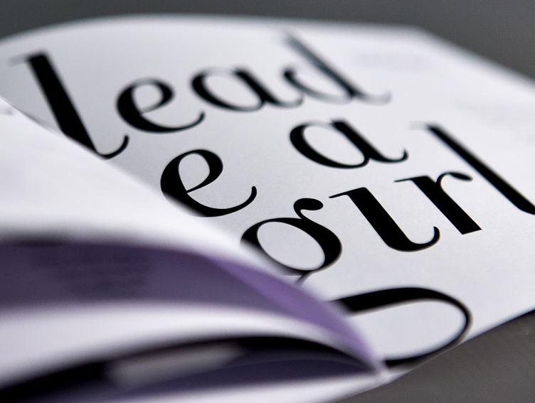
The core value ‘it's all about the girls’ held utmost significance in the brand portrayal. This was achieved through a deliberate emphasis on featuring girls in the photography, coupled with a distinctive typeface that encapsulated their confidence to flourish.