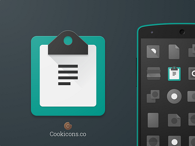
Note Taking Product Icon
Icon for a simple material note taking app. The client paid for the icon but then fell off the map. Bummed cause I'm really happy with how it turned out.
Fun fact for Material Nerds: I purposefully didn't define the top of the long shadow to avoid creating a distracting bright white triangle at the top right corner of the paper: visual integrity > rules.
Also, check out my design process: https://plus.google.com/102718493746376292361/posts/eKgHeEbg694
More by Cookicons View profile
Like
