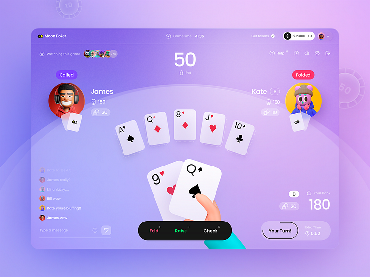
Web3 Poker Gaming App
My first shot at Dribbble! Very exciting!
I drew this interface as part of my work on decentralized poker. The design concept didn't make it to release because we ended up going with a darker, black colored version for a more premium feel. Here, however, I really like the opposite feeling — the primacy of gameplay and the friendliness of the overall vibe from the interface.
I paid special attention to the color combination and gamma in my work on the UI: it's bright and in the same palette, but with clear accents and coloristic hierarchy. I drew gradients here with special diligence 😁
Like a poker candy! I would really appreciate your support with comments and likes if you like this design concept!
More by Marie Melnikova | Unipaws © View profile
Like


