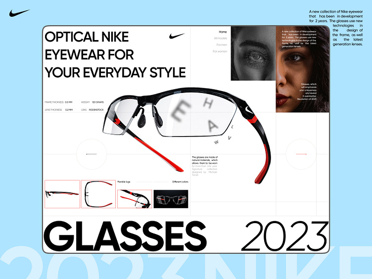
Website concept for Nike's new eyewear
Hi👋
I want to share a concept I did for Nike. I used a non-standard grid, large fonts and showed the product itself in a close up view
What do you think about the result?
I hope you like it! 😉
.
Feel free to leave feedback and comments.
Don't forget to click ❤️ if you liked it.
Thank you!!!
I'm open to new projects in different niches. Just email me at:
📪 Email: nikitastavitskiy@outlook.com
More by Nikita Stavitskiy View profile
Like
