UX Fix for more DONATIONS
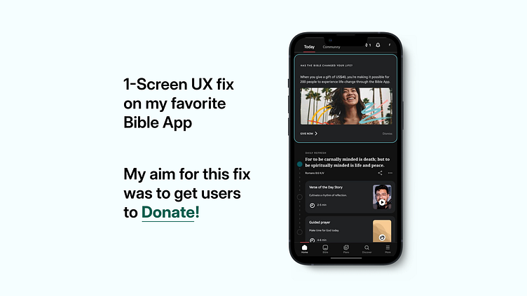
Been a while since I opened my favorite Bible App, on opening it I saw this announcement card. But it had a couple of issues in UX as well as in UI. Their main AIM is to get users/readers like me to DONATE. I proposed a fix to help them get more DONATIONS and excited readers.
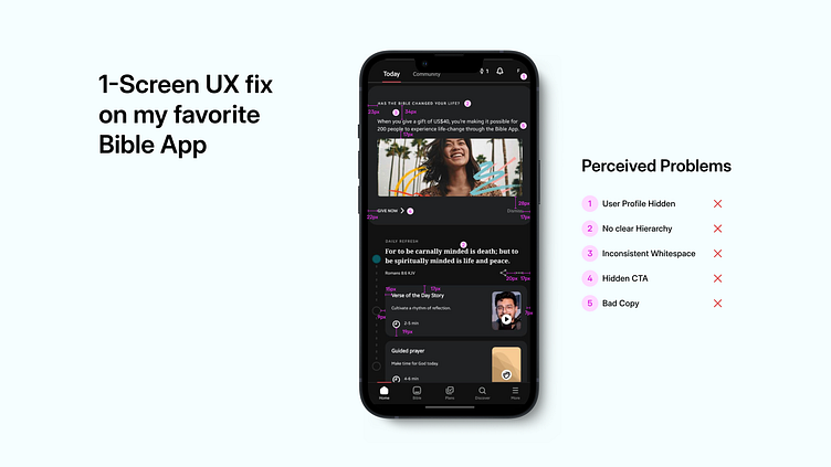
I couldn't help but extend it to the whole screen, just so it feels coherent. “I don't think I should be told the amount to donate, what if I don't have that amount or could give more, huh”. Allow me to make that decision.
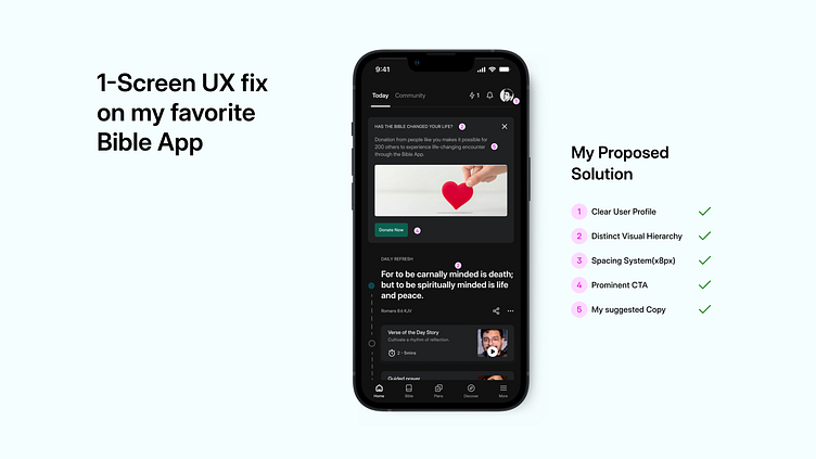
UX Fix: I made the DONATE button distinct and actionable. Also changed the tone of the copy, personalized to appeal to the user/reader. Used an image that could evoke the right emotion to get users to DONATE.
UI Fix: Maintained Hierarchy, Consistent Spacing, High Contrast for Readability and Easy Scanning.
