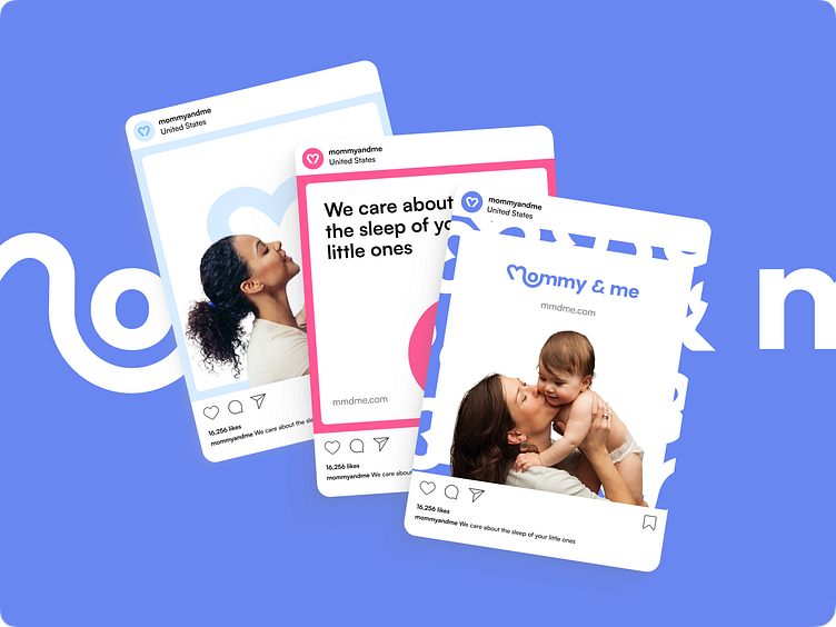
Mommy & Me - Visual identity design for children's brand
Brand's visual communication
Visual communication for a brand should be recognizable and attractive. It should also perform additional functions assigned to it. The Mommy & Me project is no exception. Their visual language includes the use of color, patterns, and the interaction of logo elements with content.
Elements of recognition
The "butterflies" pattern, made from the & element, serves as a background or an accent to direct attention to content.
Also, note how the heart image in the logo connects to happy family photos and emphasizes the importance of the parent-child bond.
More by Outcrowd View profile
Services by Outcrowd
Like


