Via Euroasia Redesign

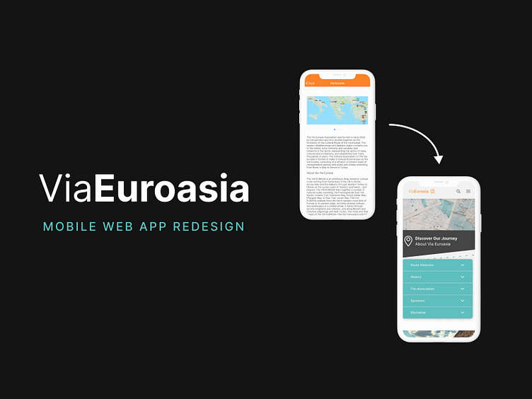
Join me on a design journey as we reimagine the digital face of Via Euroasia, the travel platform connecting adventurers with unique experiences across Europe and Asia. From user-centric UI enhancements to interactive marvels, this project showcases a fusion of design innovation and wanderlust. Let's explore the world together—one pixel at a time! 🌟 #UIUXRedesign #TravelDesign #DigitalAdventures"
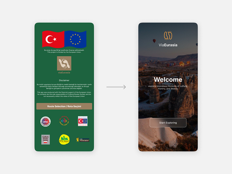
'Welcome' Screen
Transformed to exude a modern and inviting feel, making users feel more at home. The logo was redesigned for simplicity and versatility.
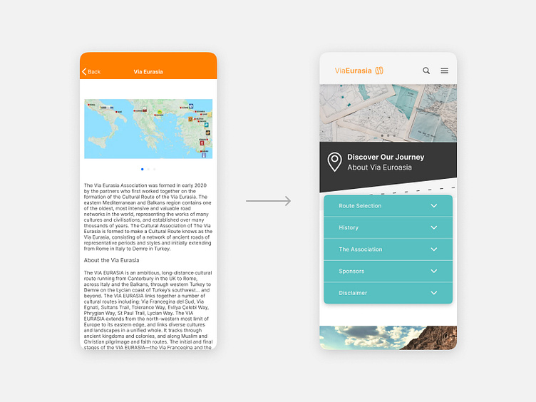
'About' Screen
Converted into a user-friendly expandable menu to minimize its text-heaviness, featuring a cohesive color scheme and subtle graphics to add to visual appeal.
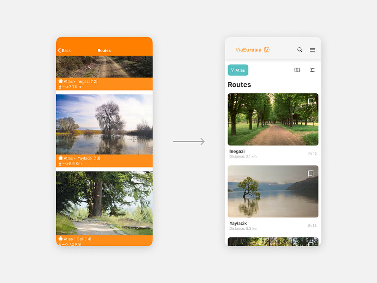
Routes Detail Screen
Card formatting simplified and intuitive icon buttons introduced for clarity.
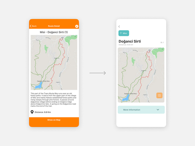
Routes Detail Screen
Copy and type changes with the addition of UI elements, such as buttons and a drop-down menu, to improve readability, reduce clutter, and enhance interactivity.
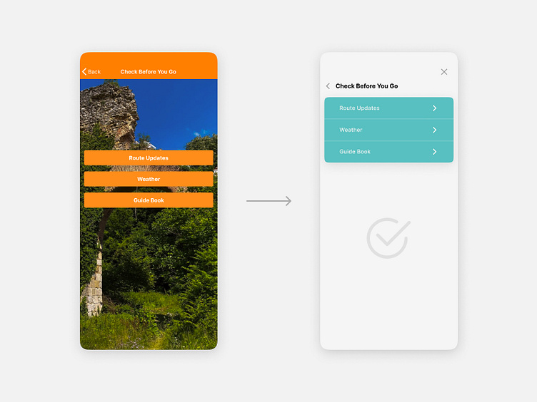
'Check Before You Go' Screen
Menu styled to match other redesigned screens. Distracting background image revoked
'Check Before You Go' Screen
Menu styled to match other redesigned screens. The distracting image was revoked to redirect emphasis to the menu items.