UI Component - Dropdown | Uzence
📥🔽 Dive into Dropdown Delights: Choices Unveiled! 🔽📥
Let's immerse ourselves in the world of dropdowns, where options unfold elegantly! 🚀 Here's a glimpse of their captivating versatility:
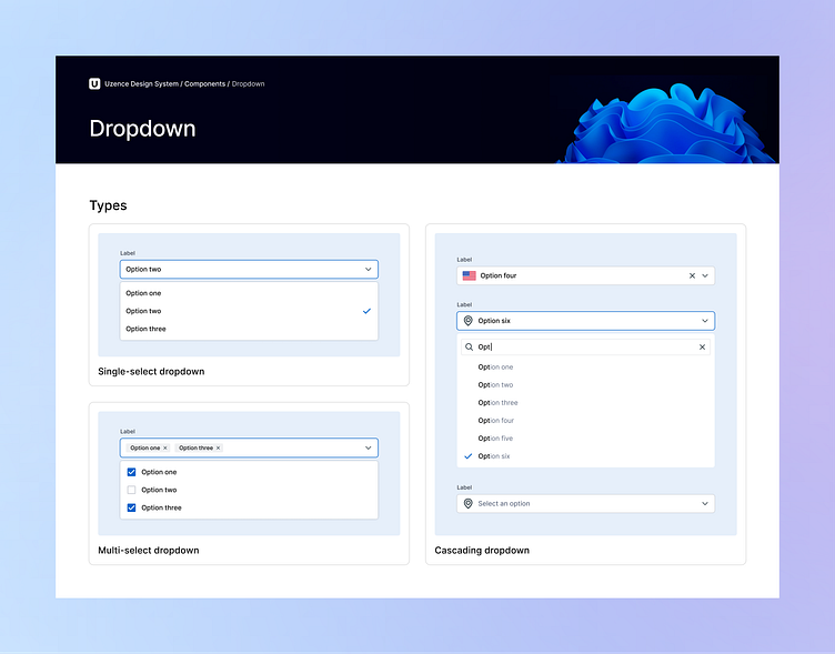
🔳 Types: Embrace the spectrum! From single-select to multi-select dropdowns and cascading wonders, choices flourish.
🔳 Subtypes: Unveil Distinct Functionalities! Delve into the world of dropdown subtypes, each designed to cater to specific functionalities. From standard dropdowns to inline, searchable, hierarchical, autocomplete, and combo box variations, a world of options is at your fingertips.
💎 Selected Option Styles & Position: Choose your elegance! Elevate the selected option with label styles, removable input chips in default or below-field positions, ensuring a refined interaction.
🎯 Selection Indicators: Elevate clarity! Enhance user experience by customizing the selected item indicator. Choose from an array of options including icons, font styling, background color, radio button icons (for single-select), checkbox icons (for multi-select), or even add your unique custom touch.
✨ States: Dance of engagement! Hover, focus, and error states interplay, guiding users seamlessly through their options.
📏 Sizes & Content: Tailored expressions! Sizes ranging from extra-small to extra-large, adorned with content types like labels, data tables, lists, and custom designs.
🎨 Styles & Shapes: Artistry in form! Choose from outlined, underlined, filled, elevated, boxed, or even custom styles, set in rectangles, rounded rectangles, pill shapes, or your own imaginative forms.
🌟 Variants & Element Styles: Play with flair! Variants like leading and trailing elements, along with styles like outlined, filled, or none, lend a unique touch.
⬆️⬇️ Direction & Position: Navigate the flow! Set dropdown direction to top or bottom, and choose where the selected item indicator shines - left, right, or at the end of the dropdown.
⚙️ Additional Configurations: Crafted precision! Configure with actions, dividers, grouping, labels, helper text, character counters, information icons, clear buttons, and even make it required.
Let's journey through the realm of user interaction! Stay tuned for more design treasures as we unfold the symphony of UI elements. 🎵✨
💖 If you're loving this exploration, hit that 'Like' button and share your thoughts. Happy designing! 🎨✍️
Got a project? Let's talk.
Ready to create unforgettable experiences together? Schedule a call with us for exciting projects and collaborations! Let's shape the future of design, one masterpiece at a time. 🎨🌟
To learn more about us, visit our website at uzence.com
Don't miss out on the creative inspiration and updates! Follow us on LinkedIn Instagram and Facebook 🌈🌌


