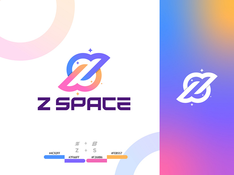
Modern Space innovative companies logo
Hey Folk!!!
The Z SPACE logo is a striking and innovative design that effortlessly captures the essence of modernity and global reach. At its core, the logo combines the bold and dynamic letter "Z" with the sleek curves of the letter "S," forming a seamless fusion that embodies the company's values and aspirations.
The fusion of these letters signifies the convergence of ideas, innovation, and ambition. It reflects a commitment to pushing boundaries and exploring uncharted territories, much like the boundless expanse of space itself.
The choice of a deep, cosmic blue color palette invokes the awe-inspiring vastness of the universe, creating a sense of wonder and possibility. The deep blue represents trust and reliability, making it an ideal choice for a company targeting NASA-based organizations and global enterprises.
The use of negative space in the logo's design is deliberate and skillful. It creates a subtle, hidden arrow within the letterforms, symbolizing forward momentum, progress, and direction. This subtle detail reinforces the idea that Z SPACE is not just a company; it's a guiding force propelling its clients and partners toward new horizons.
Overall, the Z SPACE logo is a masterful blend of simplicity and complexity, tradition and innovation. It's a visual representation of a company that's deeply rooted in global outreach and digital innovation, while always looking onward and upward towards the limitless possibilities of the future.
Here is my new "Modern logo mark"
(Available For Sale)
Concept: Modern Letter Z+S simple logo mark
The rope represents the soulmate's stable connectivity
Let's talk about your brand projects
Email: pixtenbrand@gmail.com
WhatsApp: +88 01312134050
