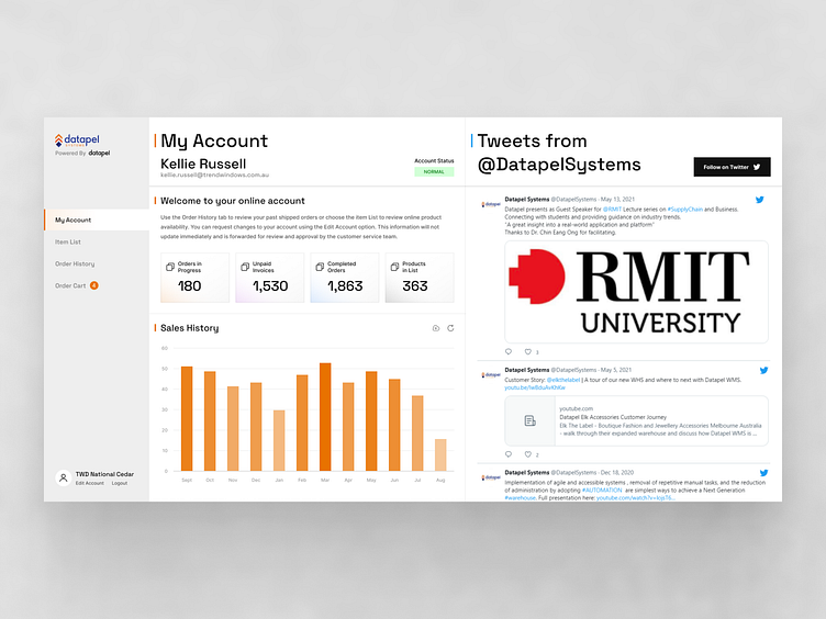
Redesigning Datapel Client Portal's UI Design
Introduction to Datapel Client Portal
Datapel Client Portal is a platform at the forefront of warehouse management solutions. With a steadfast commitment to innovation, the portal delivers cutting-edge solutions that bridge the gap between clients and warehouse managers, offering streamlined processes for inventory management, order fulfillment, and more. Through its transformative Client Portal, Datapel provides a seamless bridge between clients and warehouse managers, empowering businesses with intuitive tools and facilitating an effortless ordering experience.
Their Challenges
The old system lacked a clear and intuitive interface, making it strenuous for users to comprehend and perform tasks efficiently. Essential features were buried in layers of menus and submenus, causing confusion and frustration for both warehouse managers and clients.
The Solution
The new Datapel Client Portal takes a simple yet effective approach, placing strong emphasis on user experience (UX) principles. By thoughtfully arranging each menu section and carefully curating the content, the platform ensures that users can effortlessly navigate and comprehend complex terminologies. The intuitive interface streamlines workflows for both warehouse managers and clients, promoting an enhanced user experience that fosters productivity and satisfaction.
Responsive design:
In line with its commitment to user-centricity, a lot of effort was invested in a comprehensive responsive design that caters to users across all devices. Whether accessed on desktop, tablet, or mobile screens, the Client Portal maintains consistent usability and visual appeal.
Dark and light modes
Understanding the importance of personalization and accessibility, a dynamic feature that empowers users to switch between dark and light mode has been introduced. This choice not only adds an element of visual flexibility but also caters to varying preferences and reduces eye strain during extended usage.
The group came up with the concept of incorporating simplicity and clarity in the UI design. The design was created with the aid of the team led by Thomy De Croos of Creativehub.


