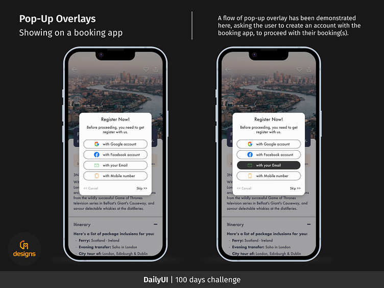
Pop-up Overlays (on a booking app)
DailyUI challenge #16: Pop-up Overlays
Here is an illustration of a flow of pop-up overlays that prompt the user to log into the booking app before continuing with their booking(s).
The first image depicts the click impact during app registration using an email address.
In the second instance, a pop-up with a form that the user must complete to register for this booking app will slide down from the bottom.
To demonstrate the significant distinction between the user flow of a blank and a filled-out form, an illustration has been provided. All of the conditions will turn green once the password has met the aforementioned requirements, signifying that the user has successfully met the requirements for a strong password.
In the last illustration, the user will get a successful prompt that they have successfully registered with the booking app and need to verify their email address. For this, they need to open their email account and click on the verify link that was shared to them by the app.
Following will be the login page, post verification of the email and details.
_____________________________________________________
Your feedback will help me enhance my design sense. Please provide me with genuine feedback.
Press L or tap the Heart icon to show me your love!
#DailyUI


