Utel's login page refresh

So a few weeks ago, I came across this page and I felt a bit overwhelmed, also noticing some UI issues like spacing, alignments, lack of contrast, etc. As a result, I decided to give it a refresh as a daily exercise, and here is the result.
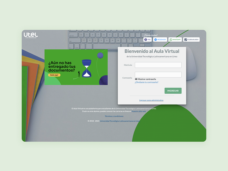
First one is the refresh and second the old one.
It's worth mentioning that this is an exercise without having had the complete context of the page; both quantitative and qualitative data. Therefore, my solution could vary.
