Fiszky - Logo Design 🎓
Logo Design for Fiszky 🎓
Brand Overview 🌐
Fiszky is an educational app 📲, enabling users to create customized flashcards tailored to individual learning needs.
Project Description 🎨
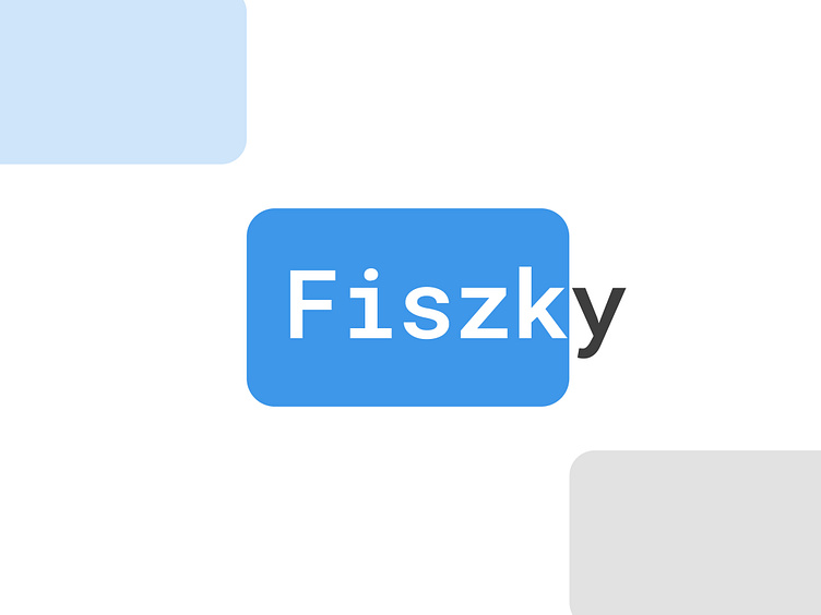
The Fiszky logo marries simplicity and metaphor. A blue rectangle with rounded corners represents a flashcard, or a paper sheet 📄. On this rectangle is the word "Fiszk," and the missing "y," placed outside in black, symbolizes the reverse side of the flashcard with a word's definition 📖.
Concept and Strategy 🧩
The key aim was to craft a logo encapsulating the product's core function, illustrating the dual-sided nature of flashcards 🗂️. The final design captures the essence of the learning process and resonates with clear recognition.
Application 📱💻
Designed with mobile and web applications in mind, the logo translates seamlessly across platforms.
Conclusions and Reflections 🏆
The Fiszky logo project proves that uncomplicated yet meaningful symbols can effectively communicate a brand's ethos. The use of metaphors and symbolism 🔍 has allowed for an image that connects with the company's mission, reflecting a unique approach to learning. The black "y" outside the rectangle not only stands as a distinguishing feature but also a memorable icon, emphasizing Fiszky's innovation and individuality 💡.


