Athena: Making brand interactions more human-like
A brand is like a world of its own, captivating users to remain within
In design, the greater the array of possibilities a platform presents, the more crucial maintaining a consistent and cohesive visual identity becomes. This principle holds true for ConverSight, where the integration of a diversity of features calls for a sense of continuity across all user interactions within the platform.
According to this principle, the guidelines crafted by our Branding Team ensured that ConverSight’s visual environment remained harmonious and unchanging, particularly when interacting with Athena, its virtual assistant.
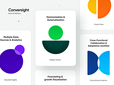
We designed all pictograms, such as the VA’s facial expressions and icons adding context to features like security and playback settings, to visually integrate with one another. The color palette, naturally, also plays a major role, so that not only the platform itself is unified in its chromatic use, but also extending the immersive experience outside screens to external elements, including advertising panels and exhibition booths.


