Lars Own :: Website
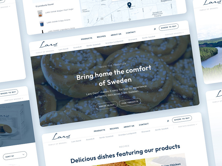
Throughout the design of the Lars Own website, we enjoyed applying and extending the food importer’s clean and restrained brand identity.
White backgrounds are common in the layouts, tying in to the packaging and label designs already in use. We largely avoided saturated tones in order to save that focus for the delicious-looking product and lifestyle photography.
—
Does your website need a facelift? We would love to hear about your needs. Email us at hello@llt-group.com
More by LLT Group View profile
Like
