App Settings
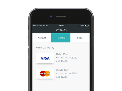

I was playing with some different card screen options and landed on this guy. I had larger assets with more spacing but the second you added a card you'd have to scroll. Our data shows we have an equal split between Credit and Debit so giving people either or (both) seemed like a good idea. Very much a WIP.
I grabbed these slick credit card logo's from @George Vasyagin https://dribbble.com/shots/1392309-Payment-options-icons and tweaked the icons a bit.
Check the attachment for real pixels.