Shelfworthy | Login
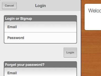
This shot shows some slight updates to the form design, along with the "drawer" design for the nav section. This is a piece that slides up from the bottom of the page to handle things like logging in or adding an item to your shelf.
I'm still not totally happy with the form elements. I think they work great in a touch environment, but I think they feel awkward to use with a mouse.
I might just bite the bullet and have the forms look slightly different in the desktop or mobile context.
More by Chris Drackett View profile
Like
