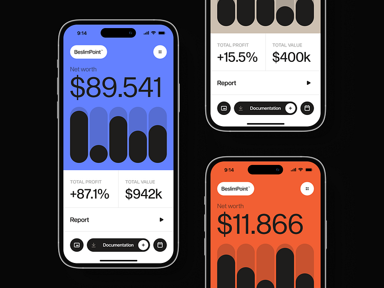
Fintech concept design of an analytics mobile app | Lazarev.
Here’s another look at the mobile version of a financial analytics platform 💸
It’s a concept, but it can turn into a real project wink-wink.
For now, let’s talk more about mobile design.
📱 The thing about it is that there’s far more to consider than just putting your desktop product on a smaller screen.
For starters, it’s vital to ensure that core features and content are accessible and optimized for touch interaction.
Plus, all the buttons, links, and interactive elements should be large and well-spaced enough so that users can tap on them without hassle.
And last but not least, to ensure your product is all about a user-led experience, it’s important to consider people’s context and needs while on the go.
Strike a balance between keeping the design and content focused and visually appealing to deliver relevant information efficiently and being consistent with the main desktop version.
🧩 That’s what we aimed to achieve when creating this concept design. The platform users can have all the valuable analytics data and insight at their fingertips.
How do you think we did? Share your feedback in the comments section.

